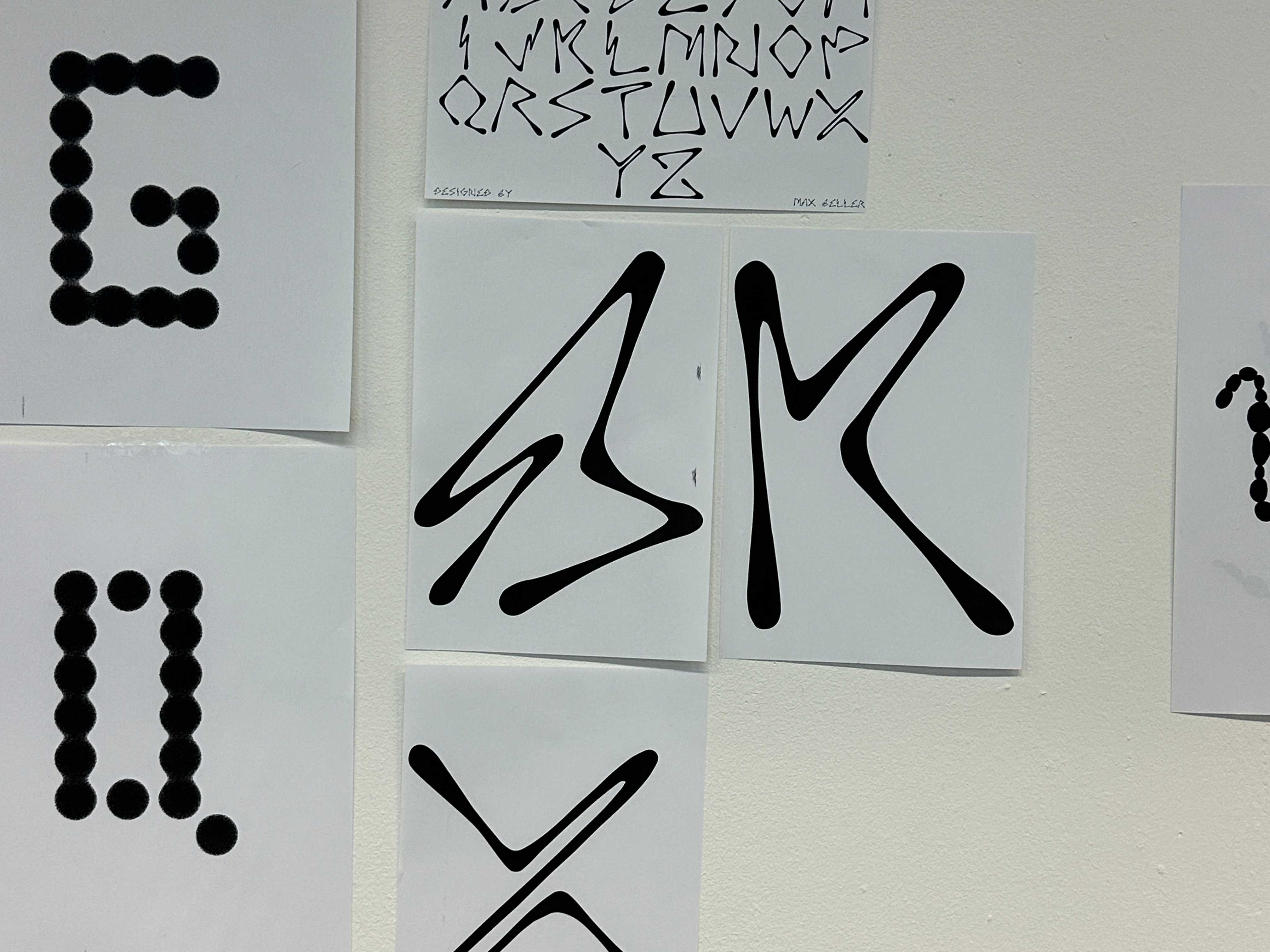
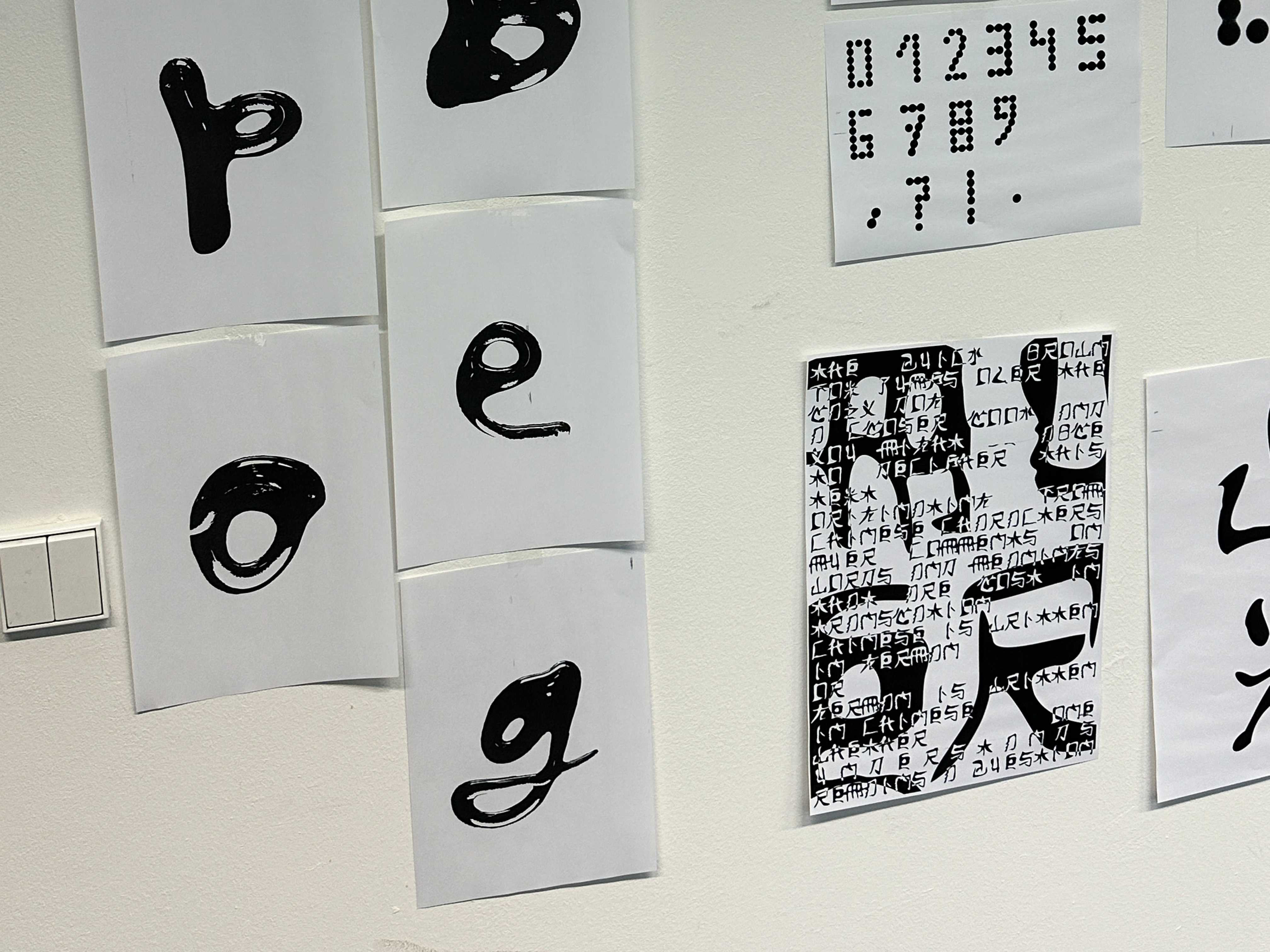
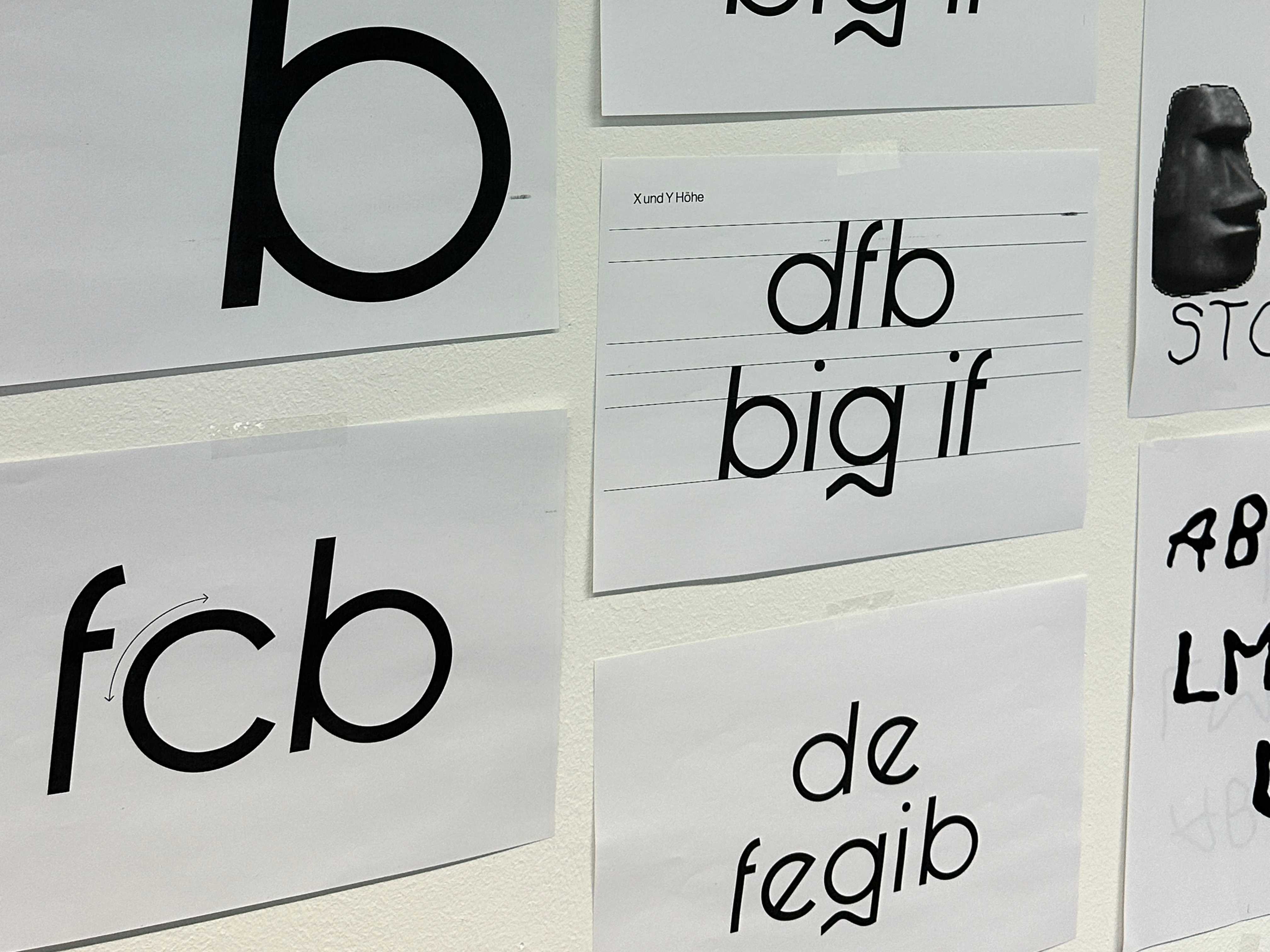
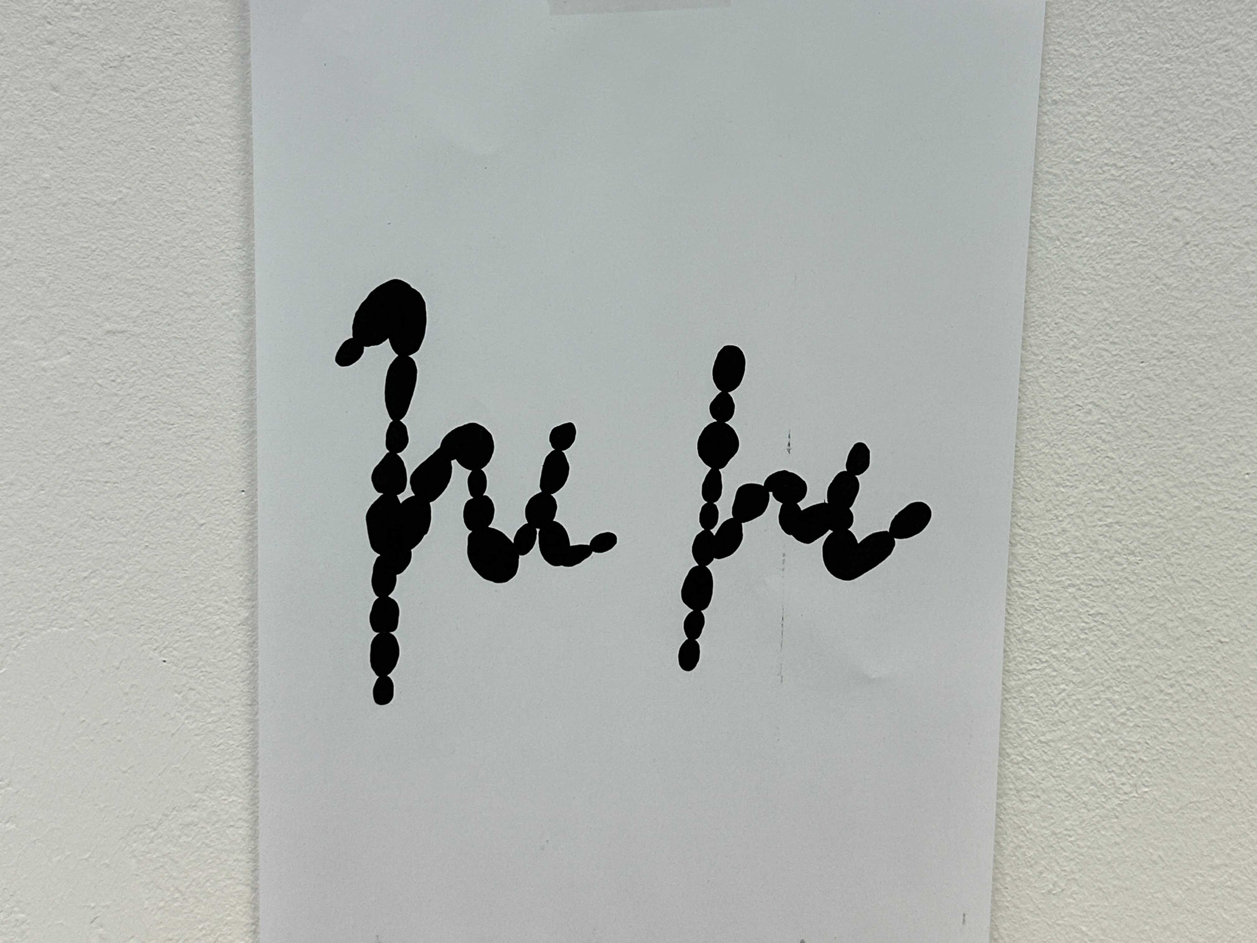
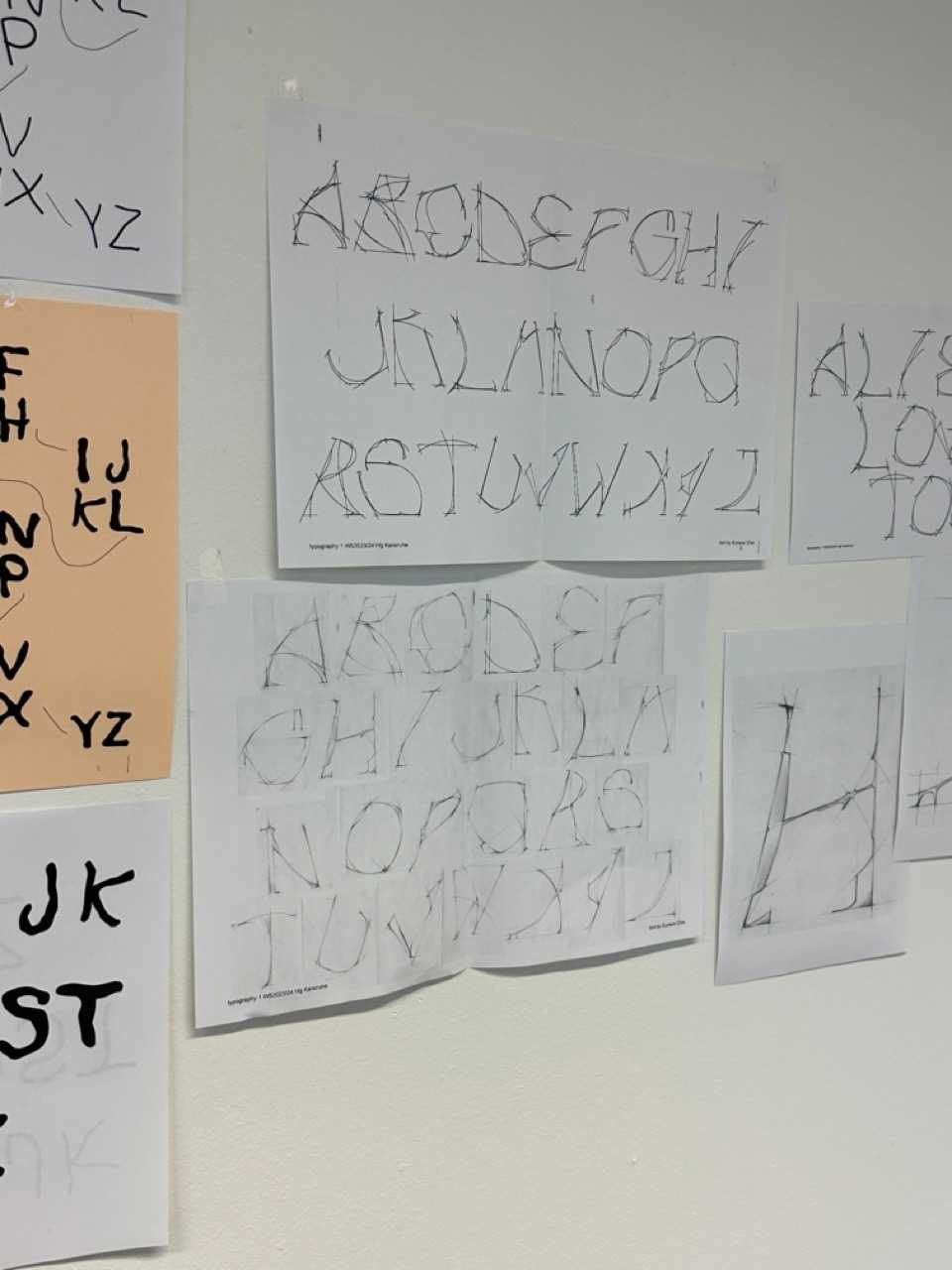
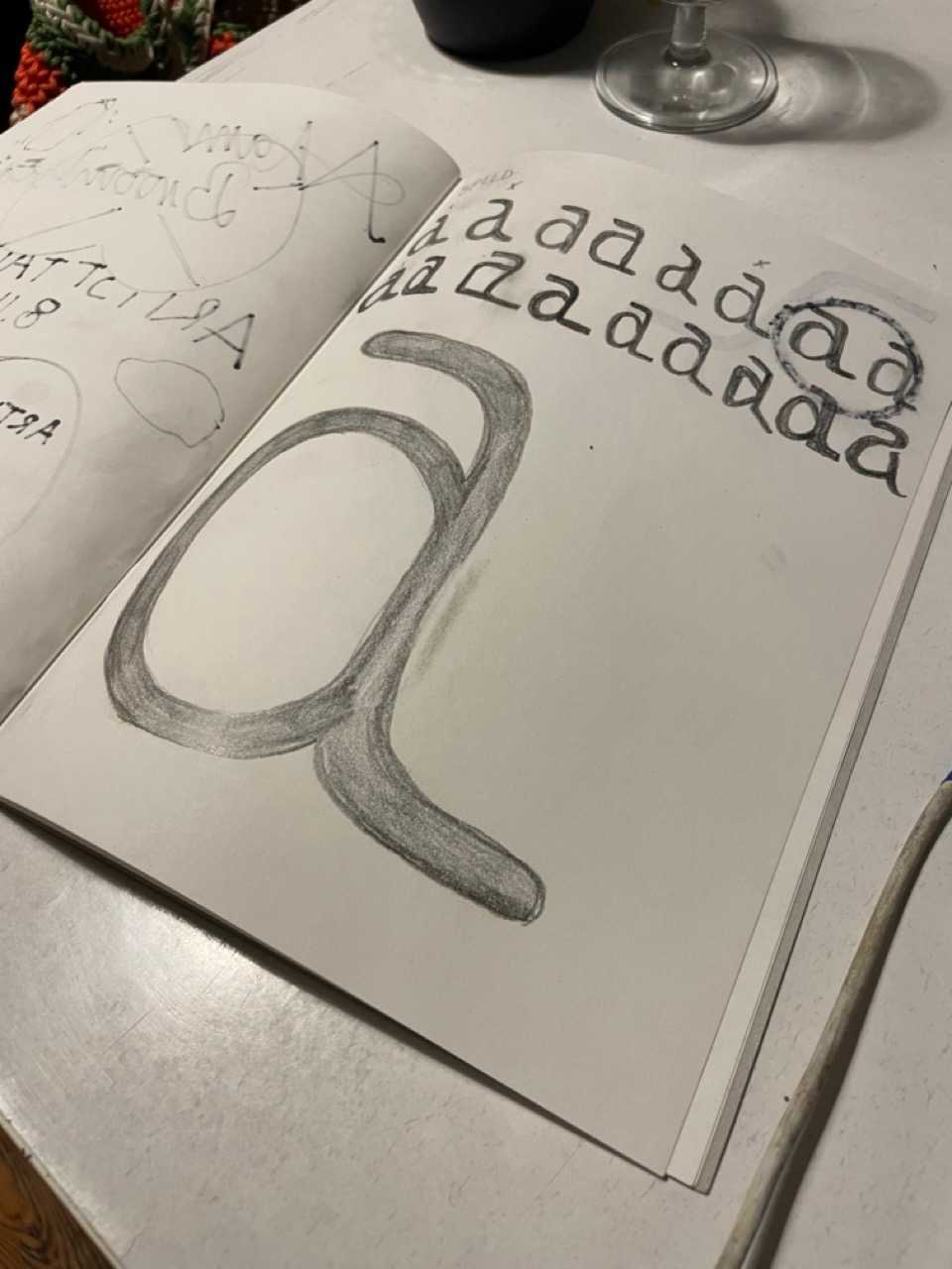
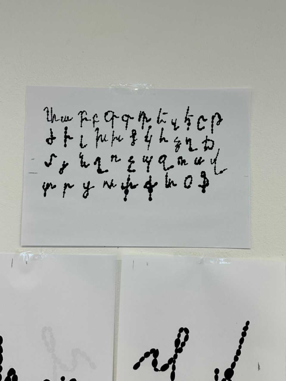
Writing letters, drawing letters, to you, to me, to strangers. To sharpen our senses, to think with our hands and touch with our minds, we will travel to pasts and futures, get in touch with ourselves, with ancestors and future generations, reconcile with butterflies and rivers and stars, dissect and rebuild the grids, structures and shapes of nature and society, come back and draw letters again.
in this seminar we learned all about the history and developments of typography, built a vocabulary to speak about letters, typefaces and text; the details, differences and classifications, about arranging letters to words and words to text; readability, emotion, communication. text as image, semiotics, vernacular typography and appropriation, the labour, ressources and ecology related to typography. We did this very hand-on, with an emphasis on critical discussions, extensive experimentation and fun.
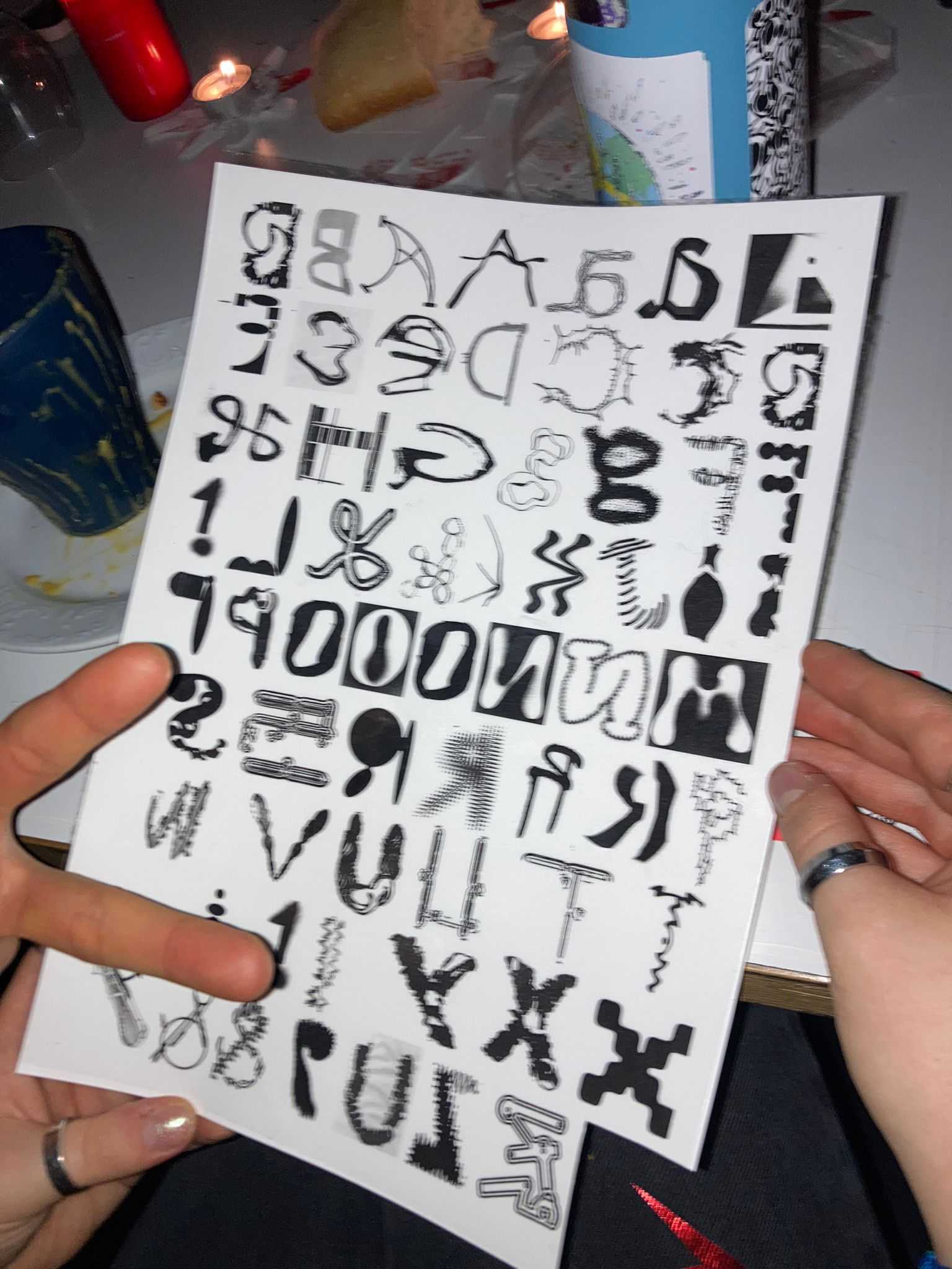
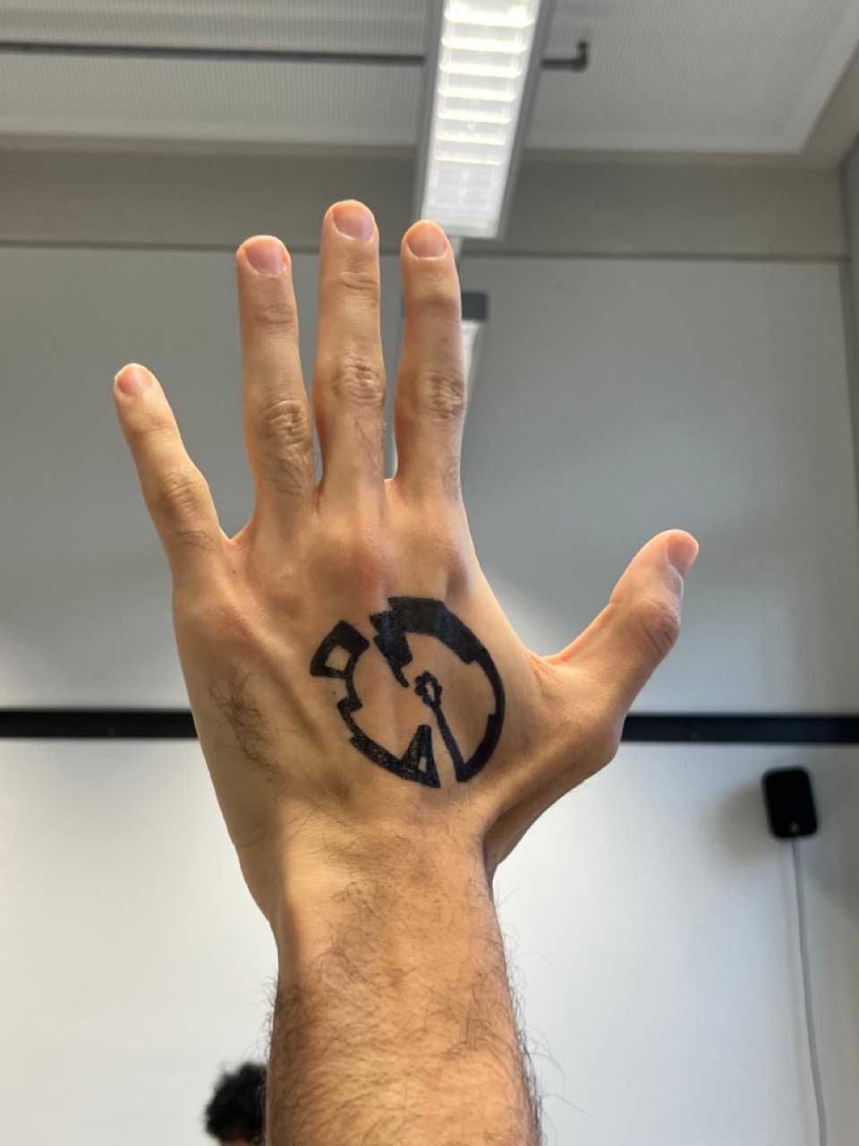
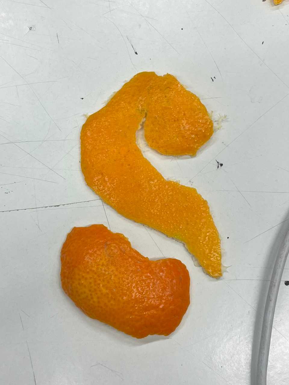
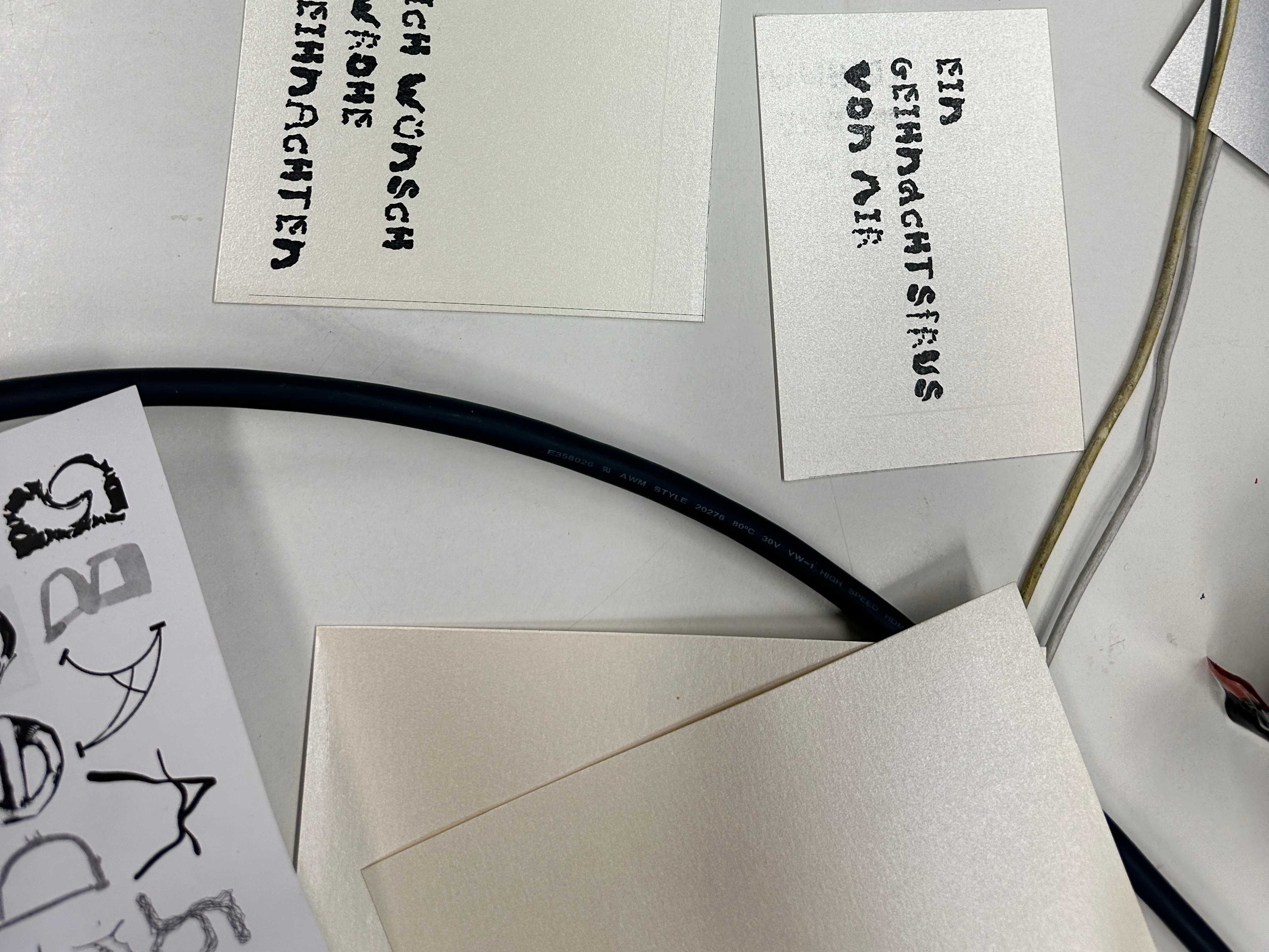
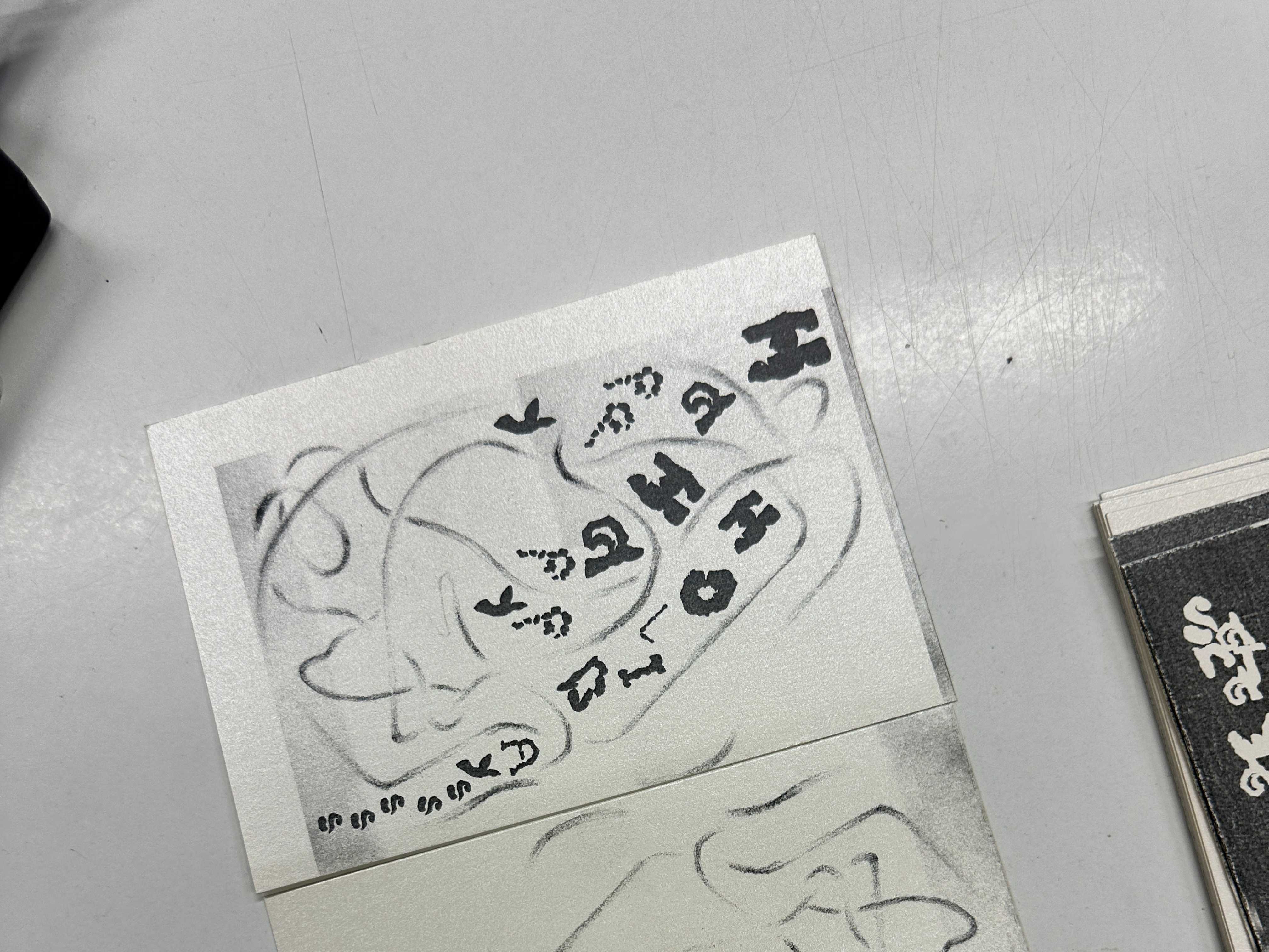
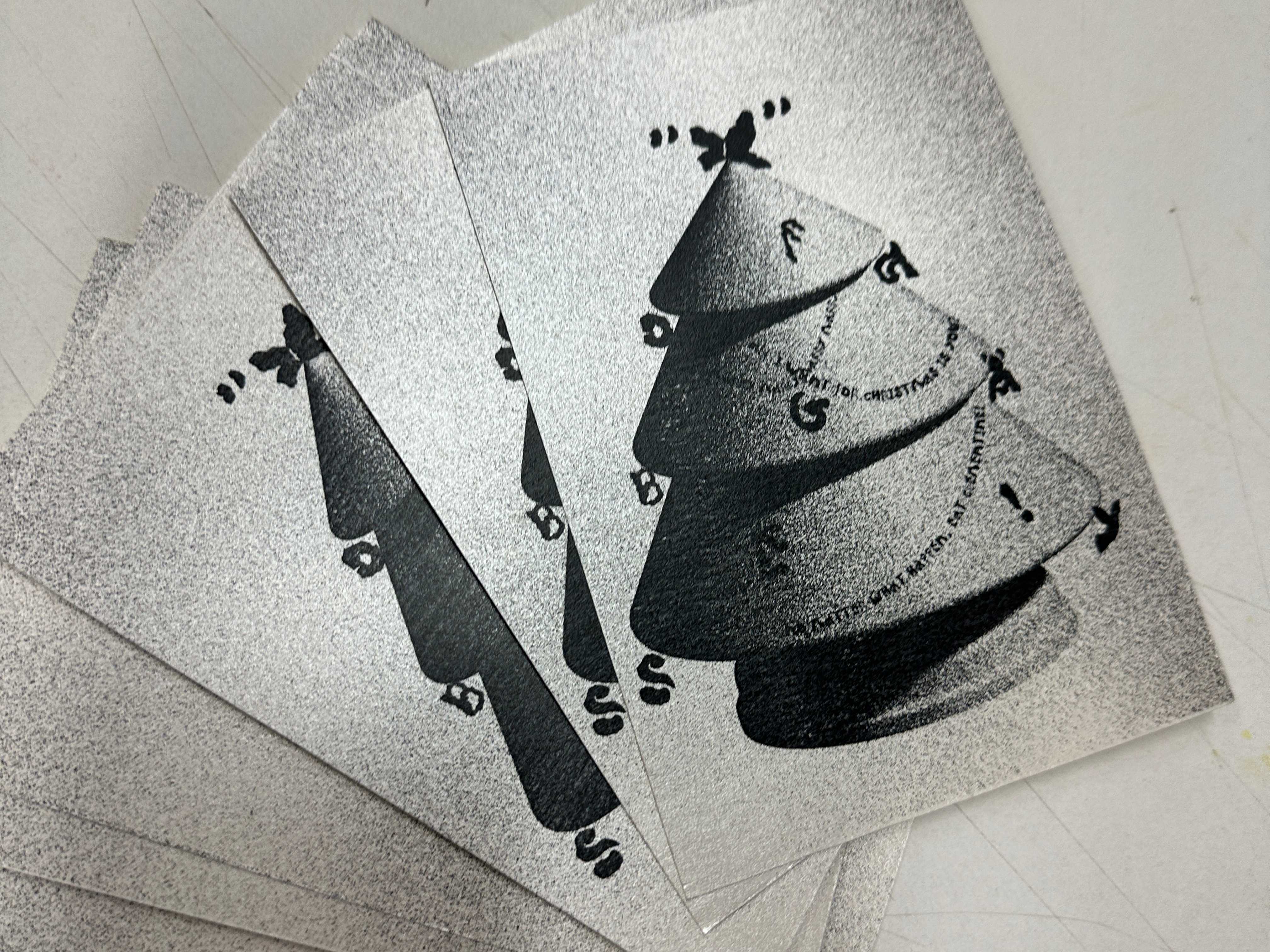
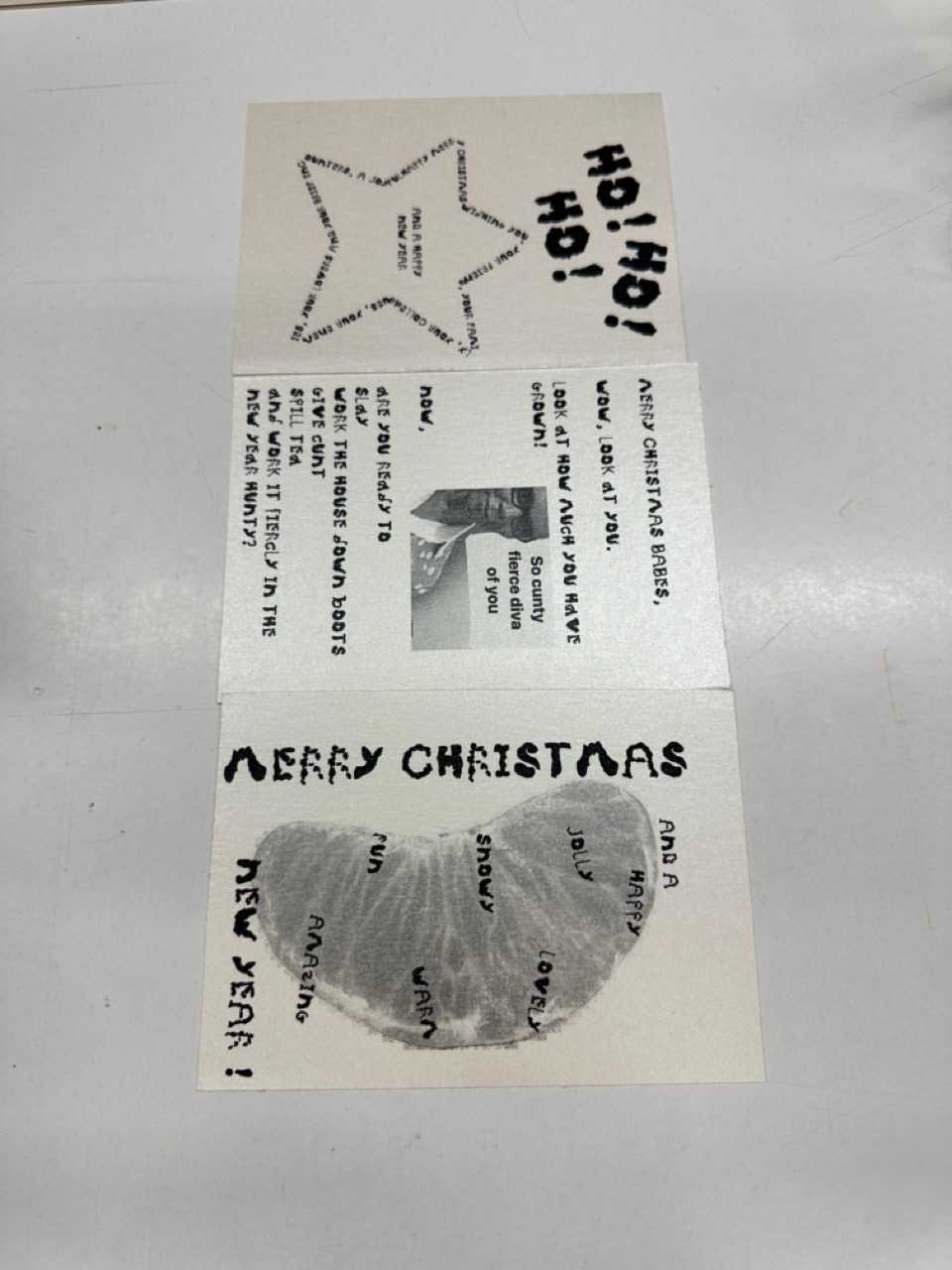
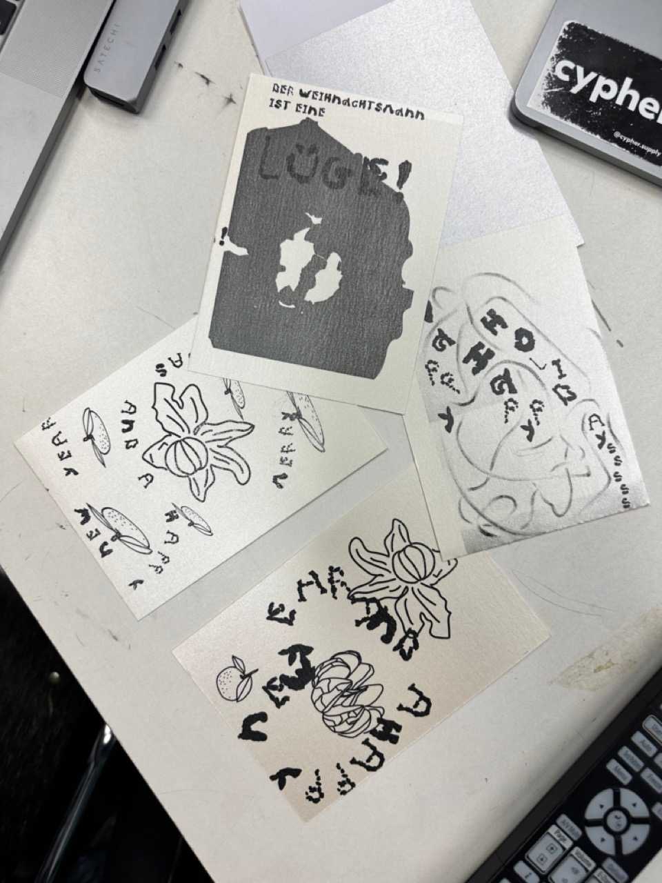
Original Letter Tattoos for our KD Christmas Party
Schedule
DAY 1: Get Well Letters (Signatures).
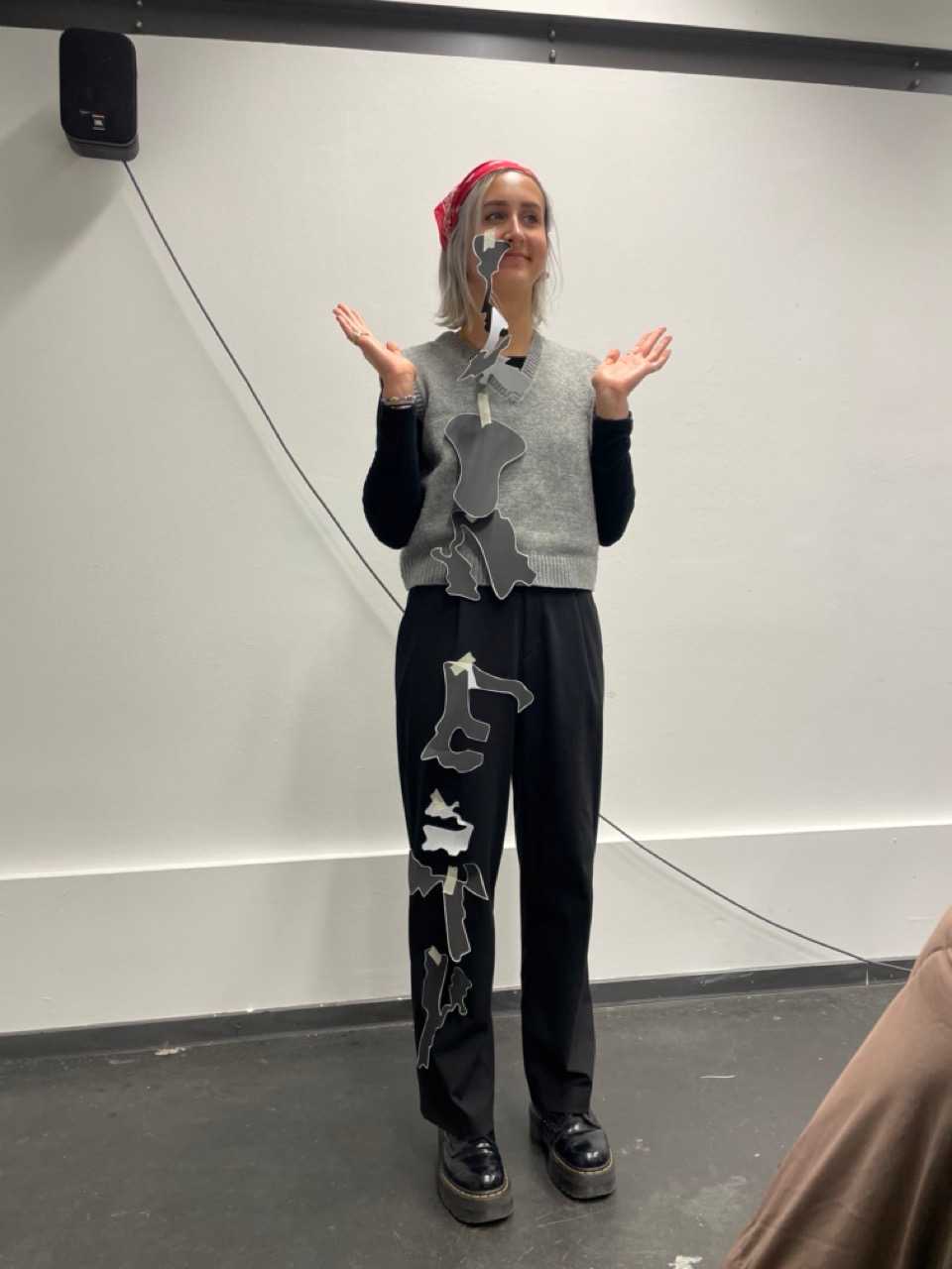
DAY 2: Letters to yourself (Line, Shape, Body)
DAY 3: Letters to Birds (Type Tools)
DAY 4: Letters to Strangers (Legibility and Expression)
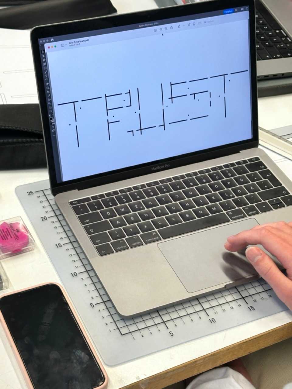
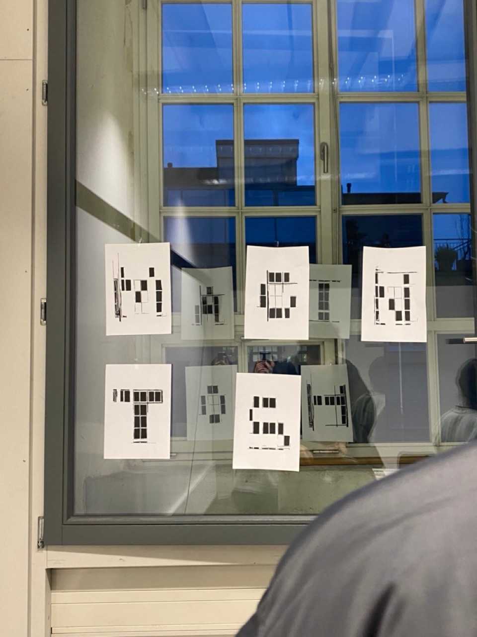
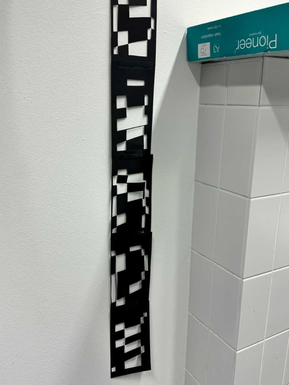
DAY 5: Letters for Accomplices (grids grids grids)
DAY 6: Letters to Idols (popular typefaces)
DAY 7: Letters to a new Year (Glyphs Workshop)
DAY 8: Letters to the Printer (Copyshop)
DAY 9: Letters to Aliens (Signs & Symbols)
DAY 10: breathing Letters (shake your letters)
DAY 11: Letters to closure (Presenting)
Goals
- Ability, commitment and skills to experiment and develop individual quality,
- Ability to achieve good readability
- Awareness for Typography: labour, readability, history, choice
Day 1: Get Well Letters
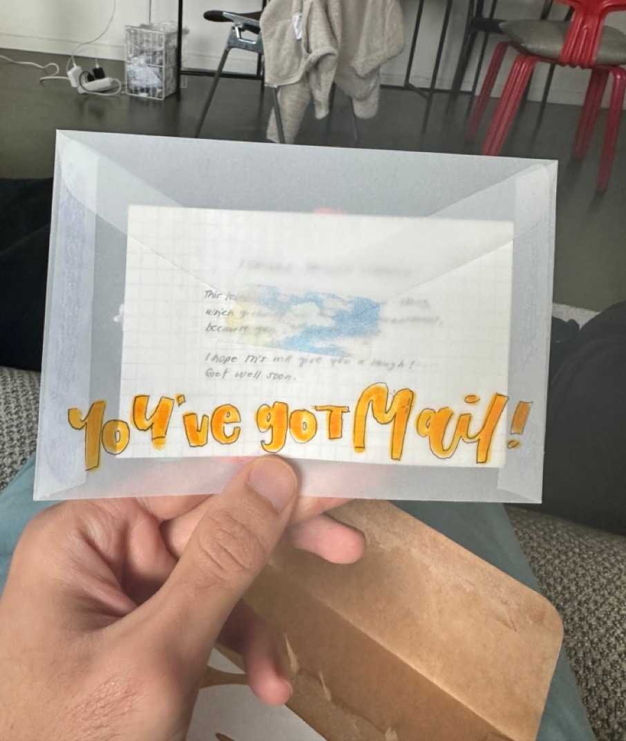
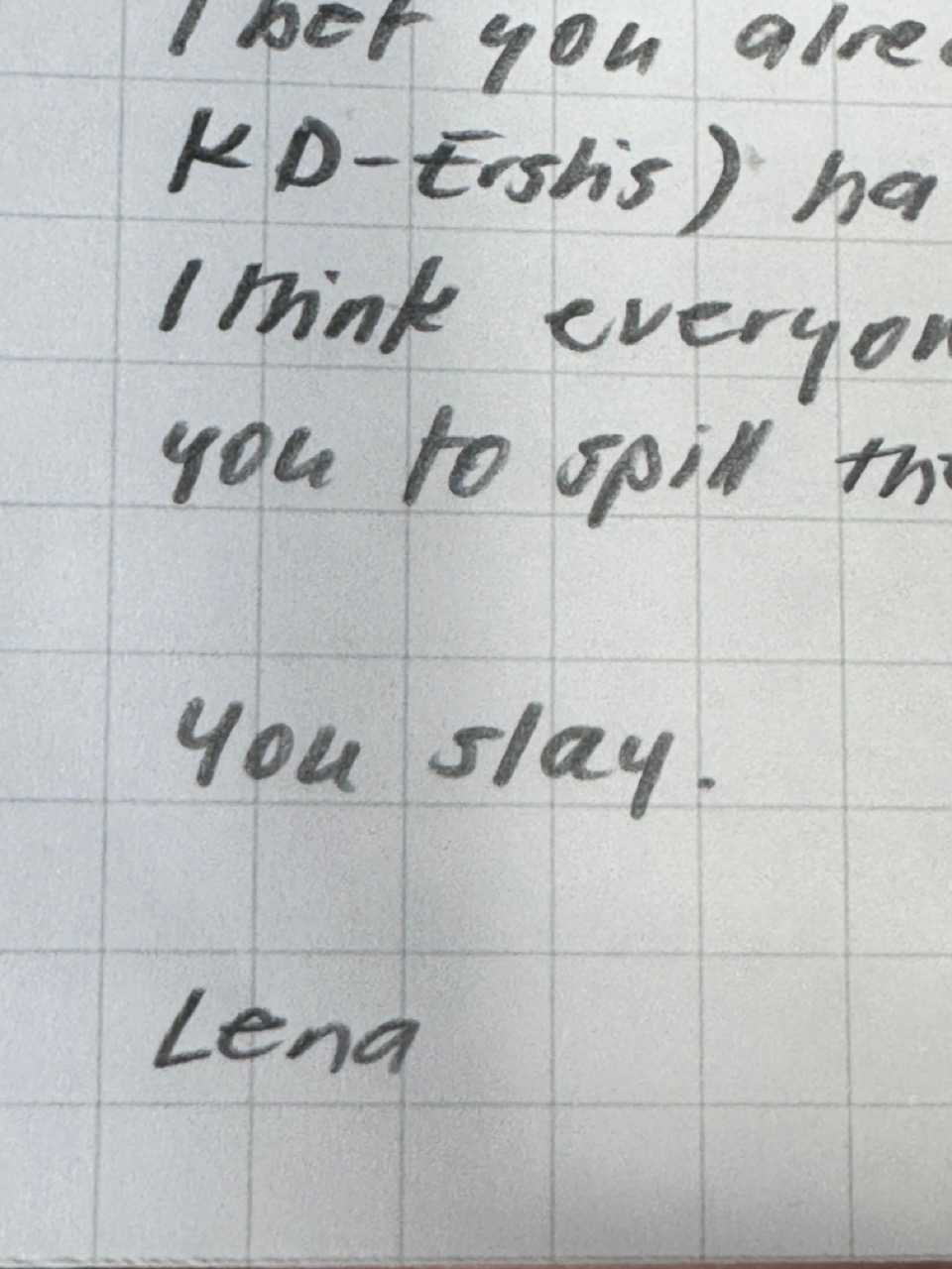
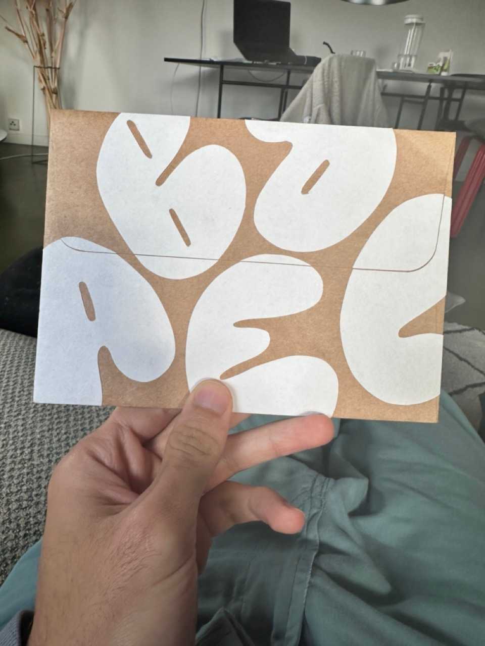
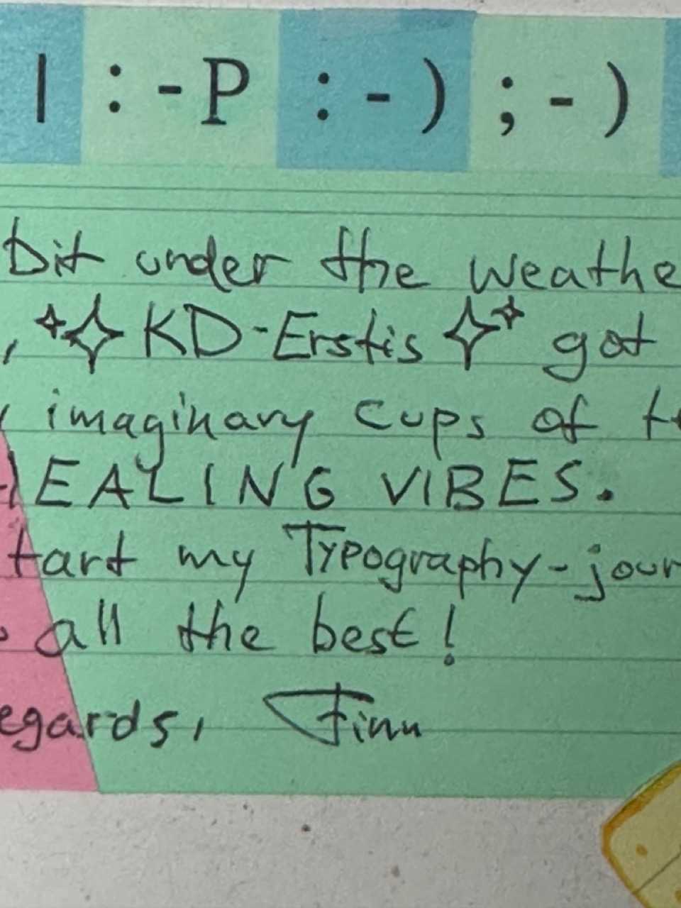
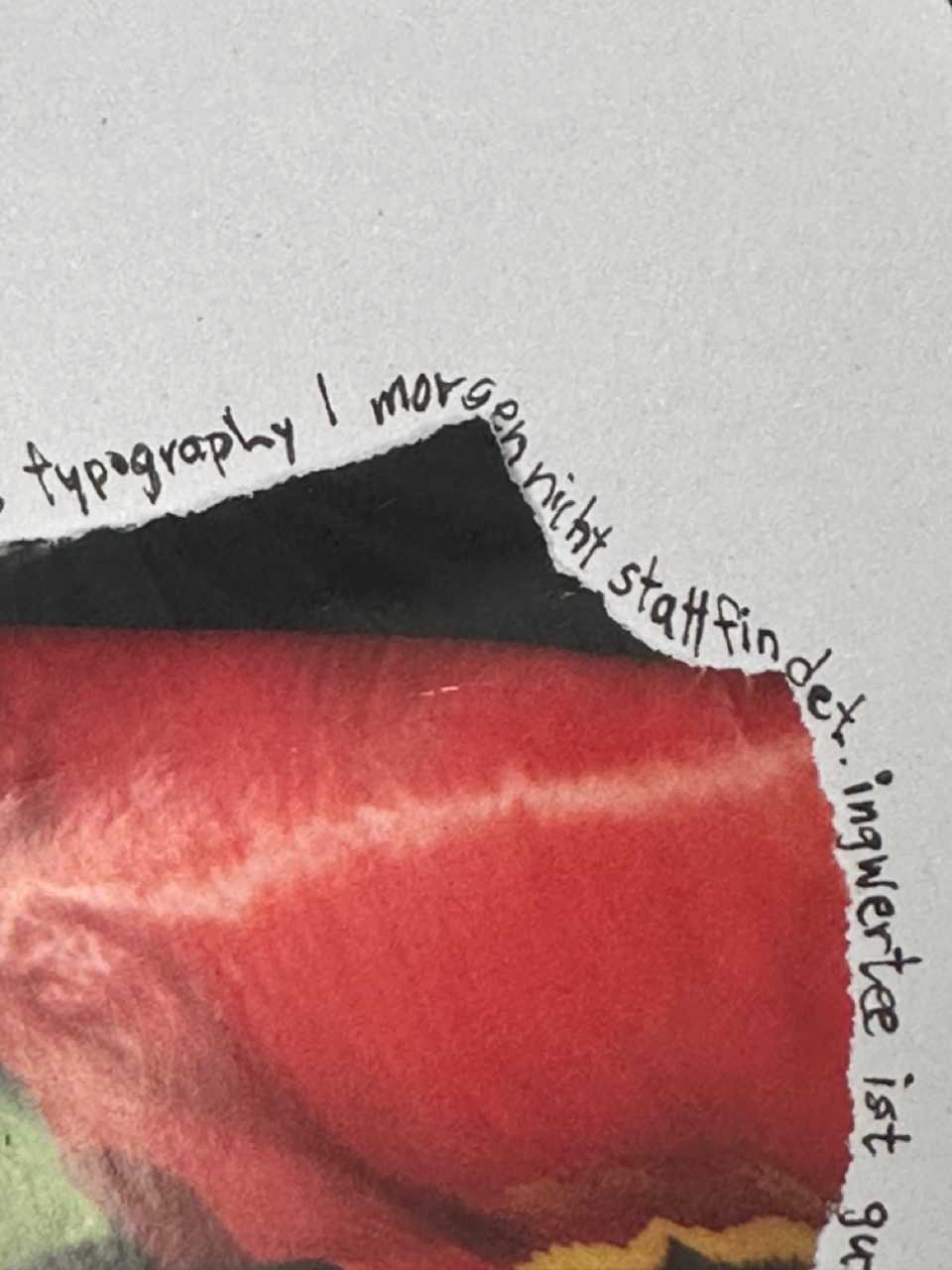
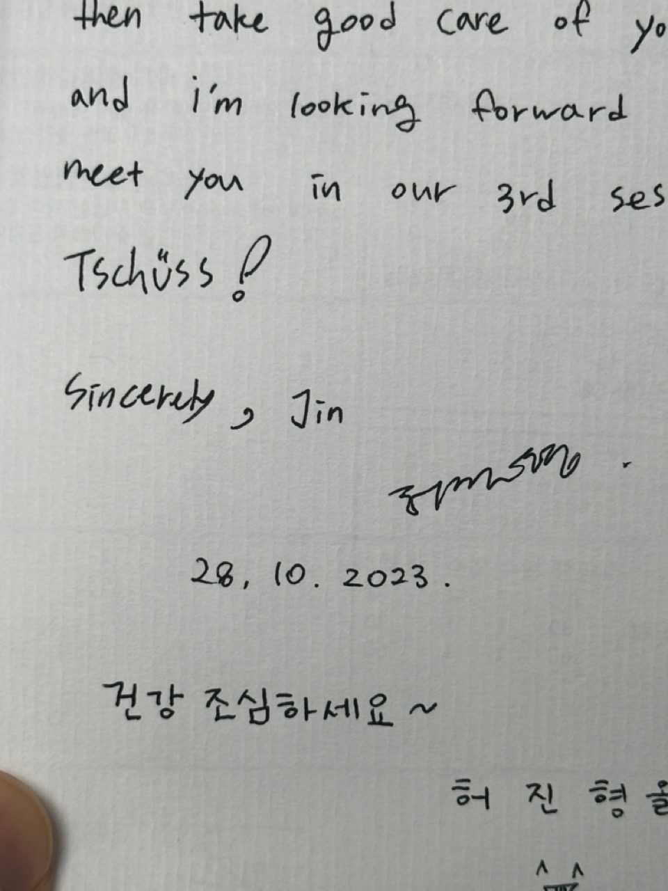
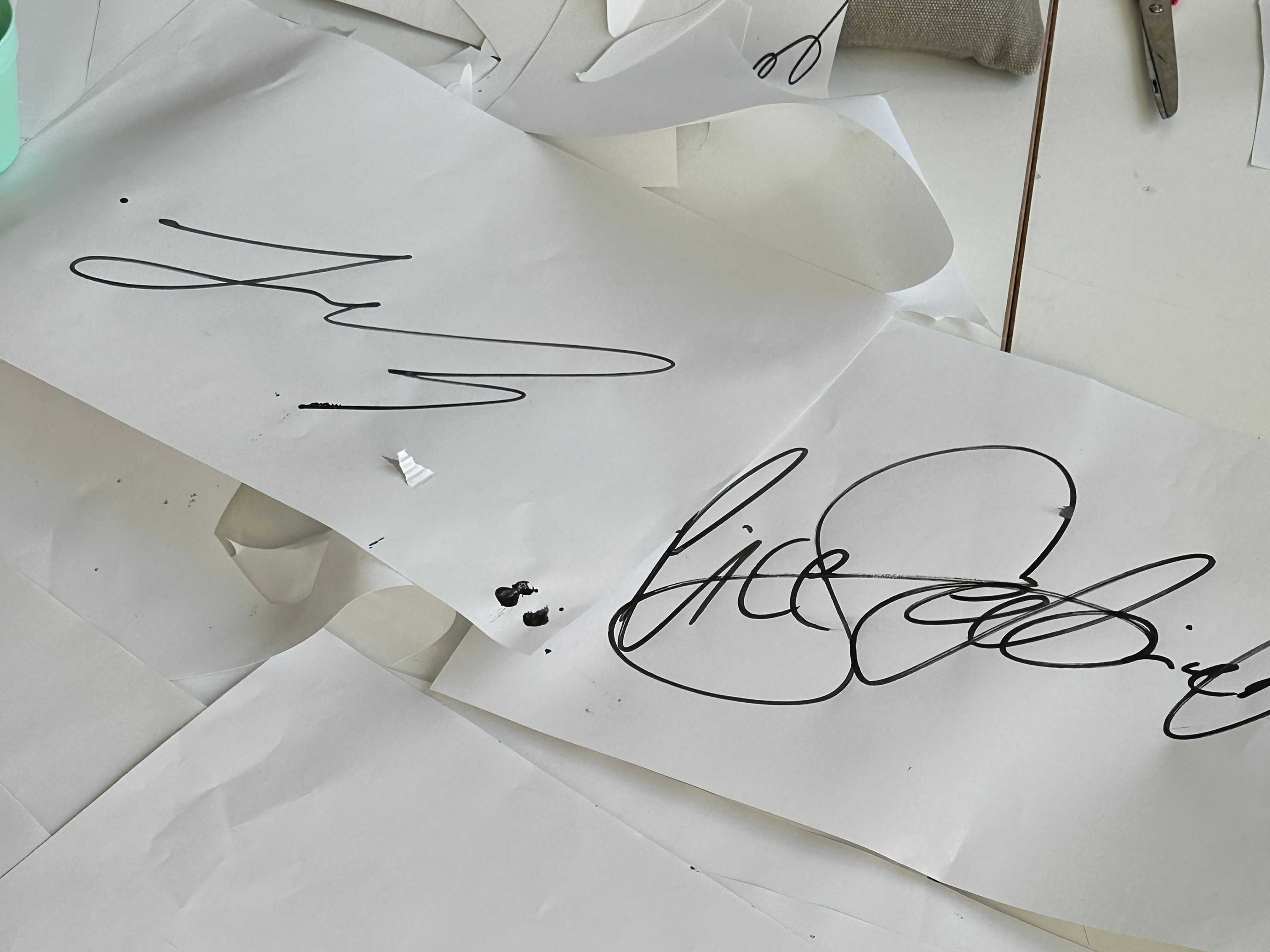
Unfortunately I got sick on the very first seminar day, so I made a virtue out of necessity and asked the class to write me get well letters. So nice to not find bills in your mail box!
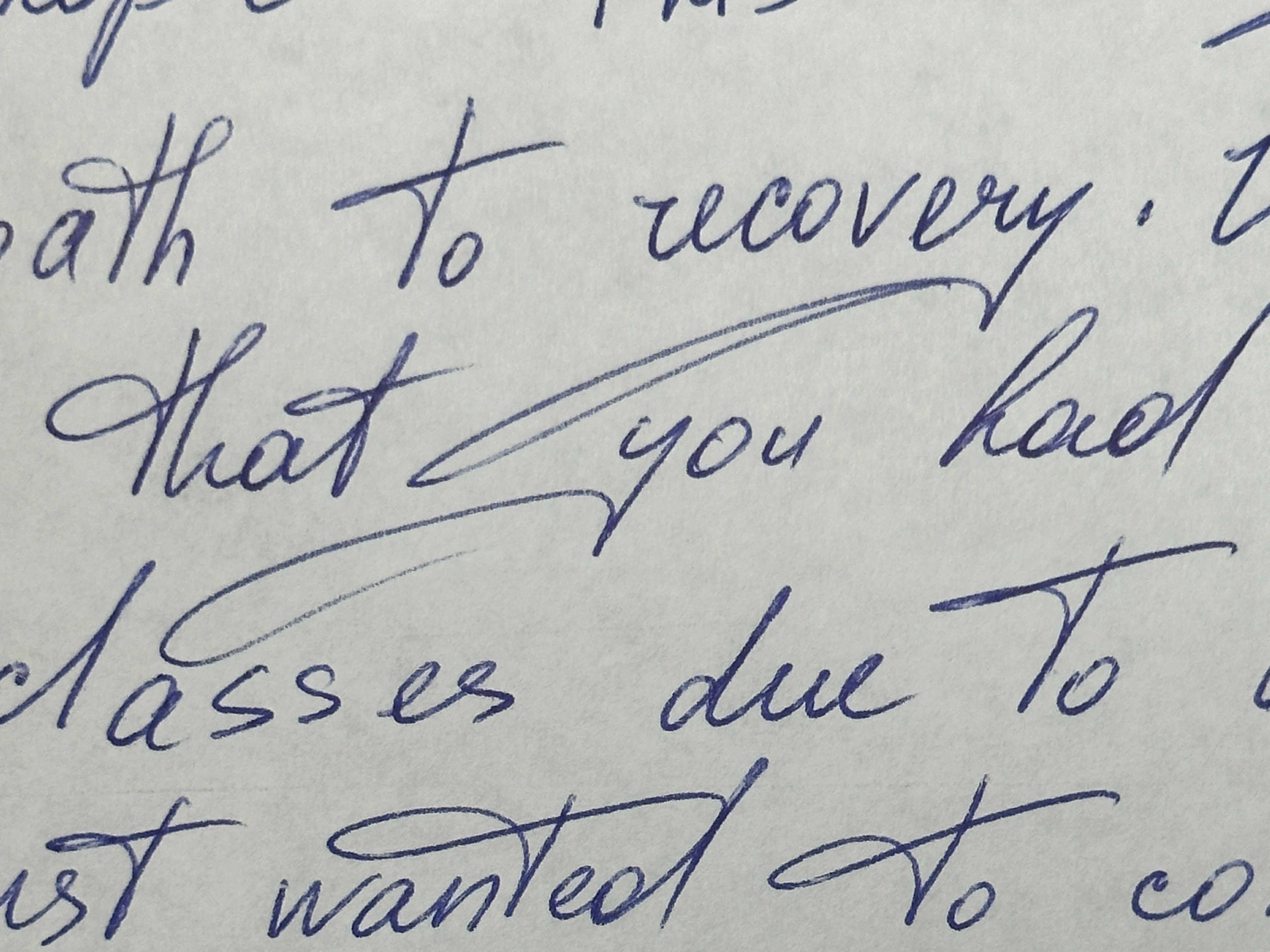
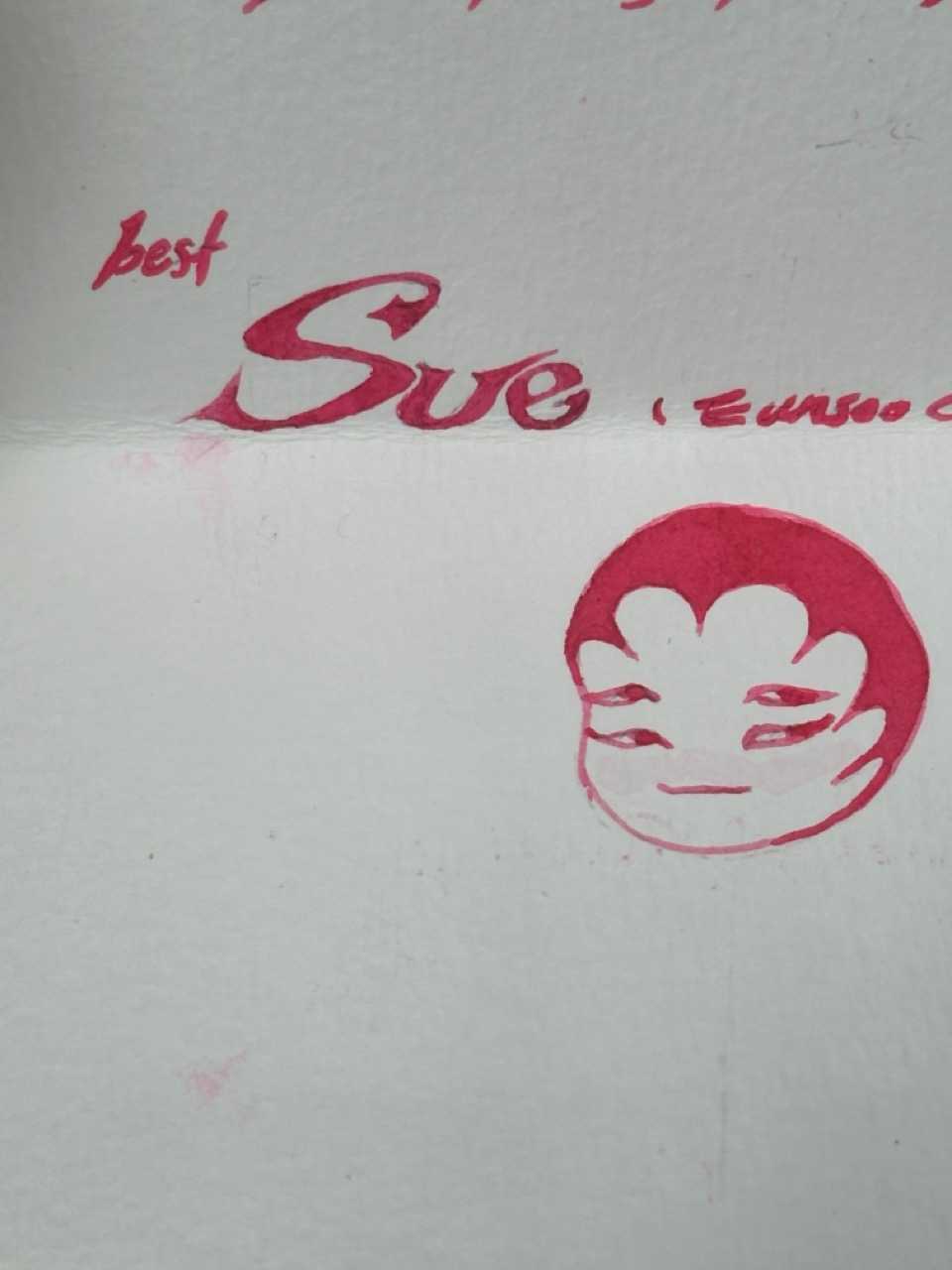
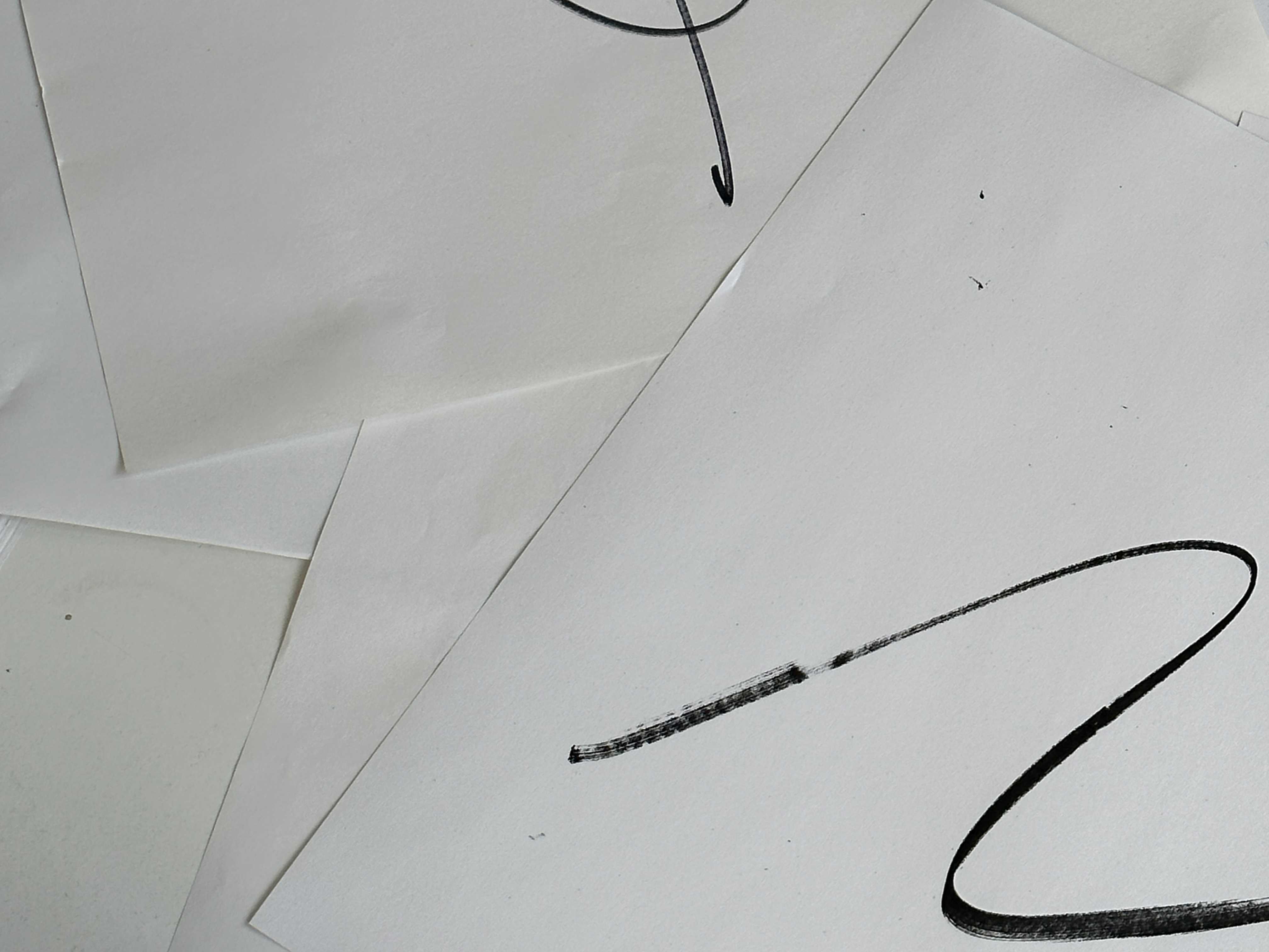
! Task: Take the day to work on 1 Letter each und send it to me per post by the end of the day. Write me an encouraging message and think about how you write it! embrace the quirks and specialities in your handwriting and show off your signature! Pay attention to the pen you use, the paper and the envelope! You can also add other elements to the letter.
Day 2: Letters to yourself
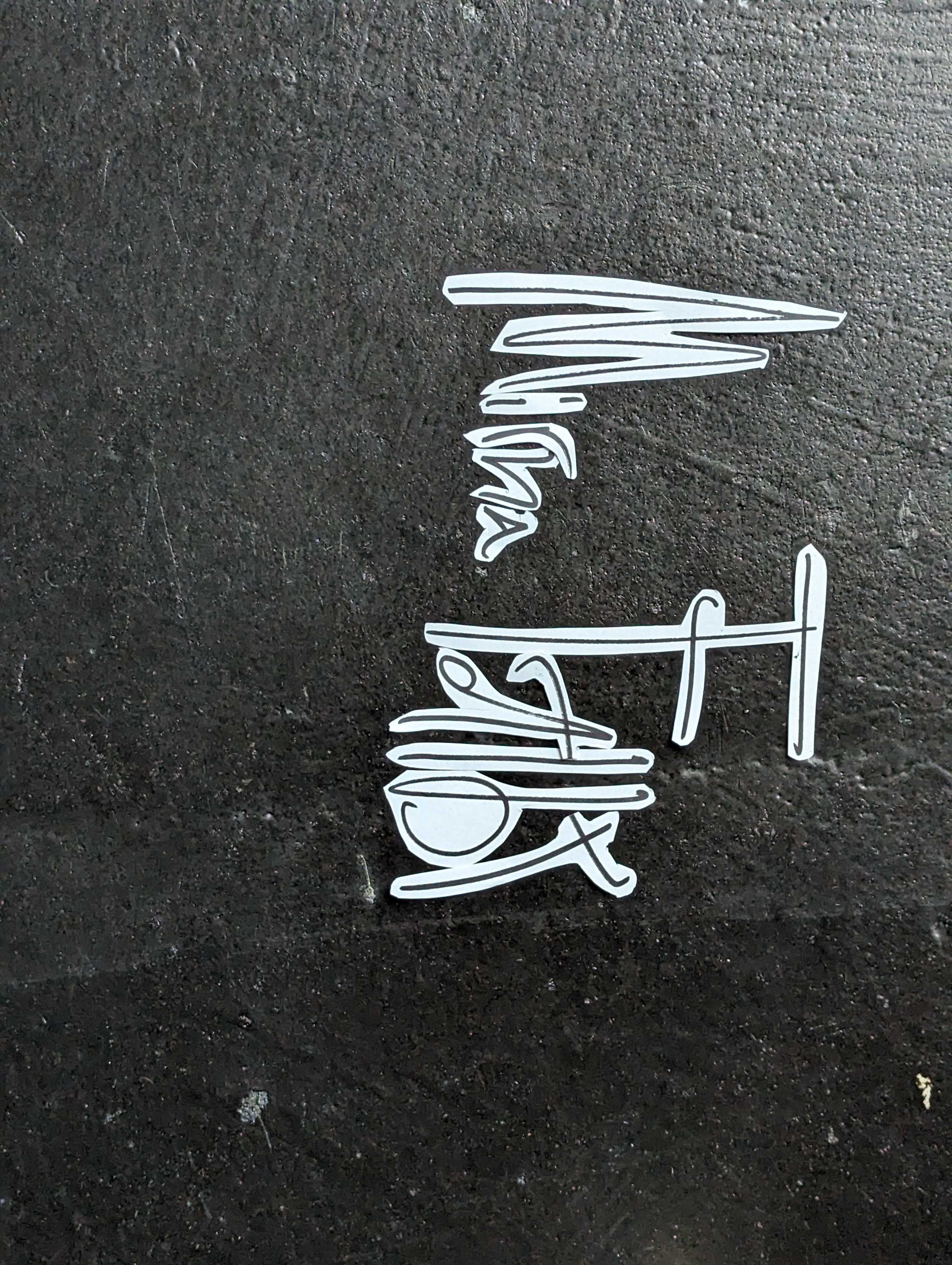
The letters led me to thinking about handwriting, especially the signature as a highly individualized token, where not only is a drawing performed using the hand and wrist that leads to more or less illegible flowing curves and angles — defined by fast motion and pressure to get things done — but also by family history, repetition, and the social construct to trust this drawing.
- write your signature big scale
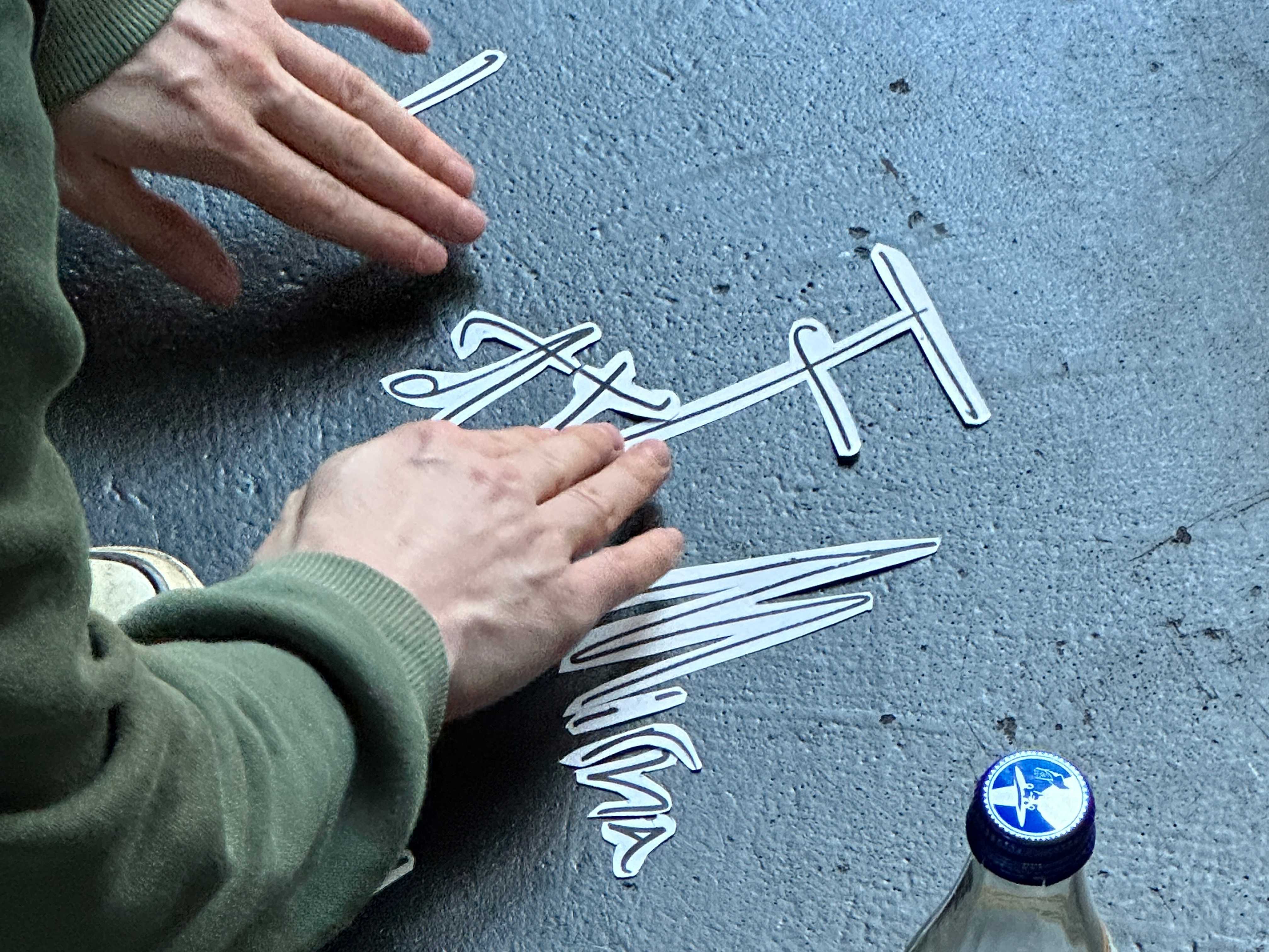
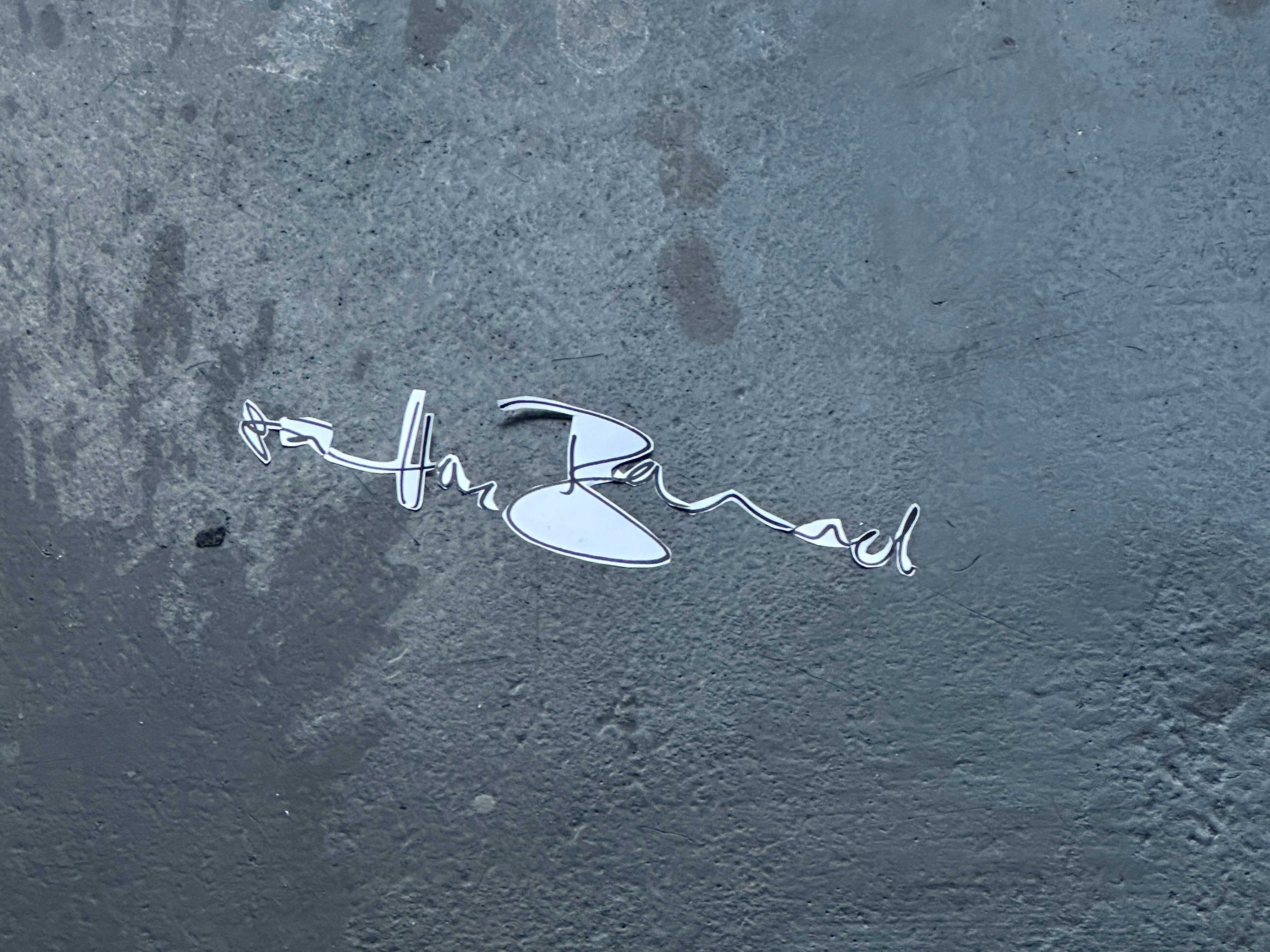
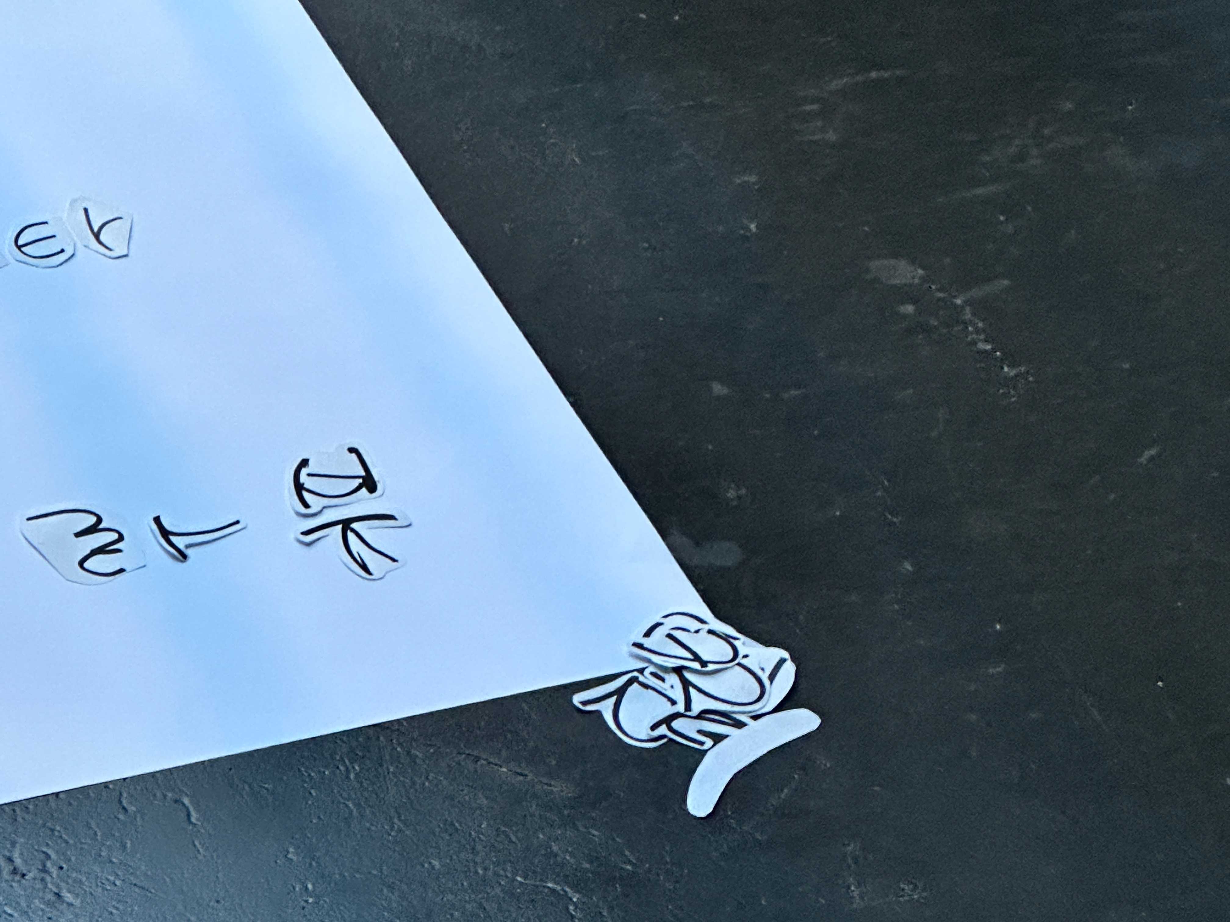
- Deconstruction: make copies and cut out each letter
- Variation: arrange the letters differently to make anagrams
- Derivation: derive the whole alphabet from the letters of your signature
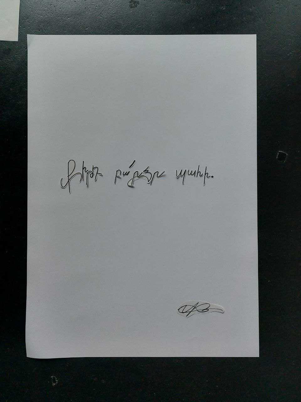
- letters to yourself write a letter to yourself on A1 with the letters you have
Day 3: Letters to Birds
For this seminar day please bring with you at least one:
- TOOL such as, a Brush, Ketschup, Crayon, Hammer, Pencil, Broom, Eraser, Scissors, Fork, Marker, Spray, Toothbrush, Printer, Drill, Vegetable,...
- MEDIUM such as, Ink, Sand, Paint, Water, Paper, Light, Foil, Pixel, Thread,...
- OBJECT such as, Paper, Planet, Box, Hand, Book, Tennisball, Bottle, Tree,...
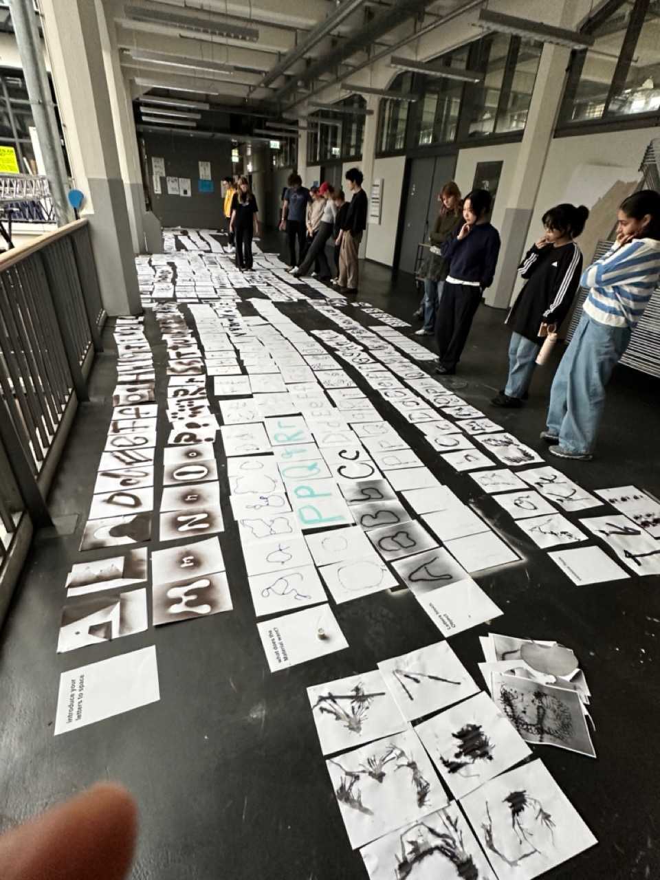
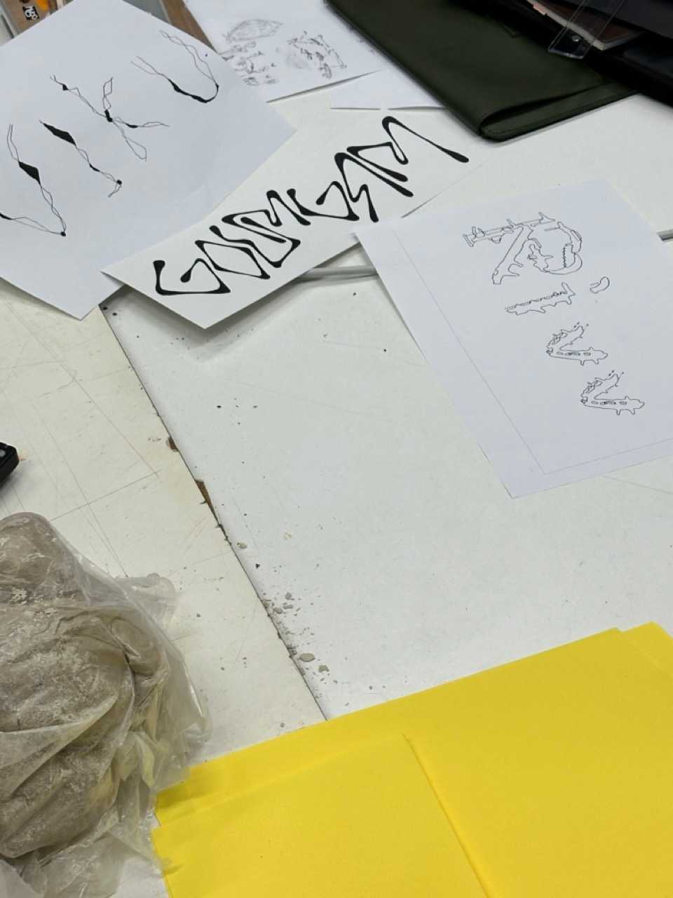
! Task: Everyone will start creating the letter forms of the latin alphabet. You have 20 minutes to draw 6 Letters, 3 lowercase, then 3 Uppercase. Move to the next station and proceed with the next 6 Letters
instructions
- what does the Tool want?
- Your “weak” arm is the Tool
- reverse flow
- introduce a rule
- combine Tools
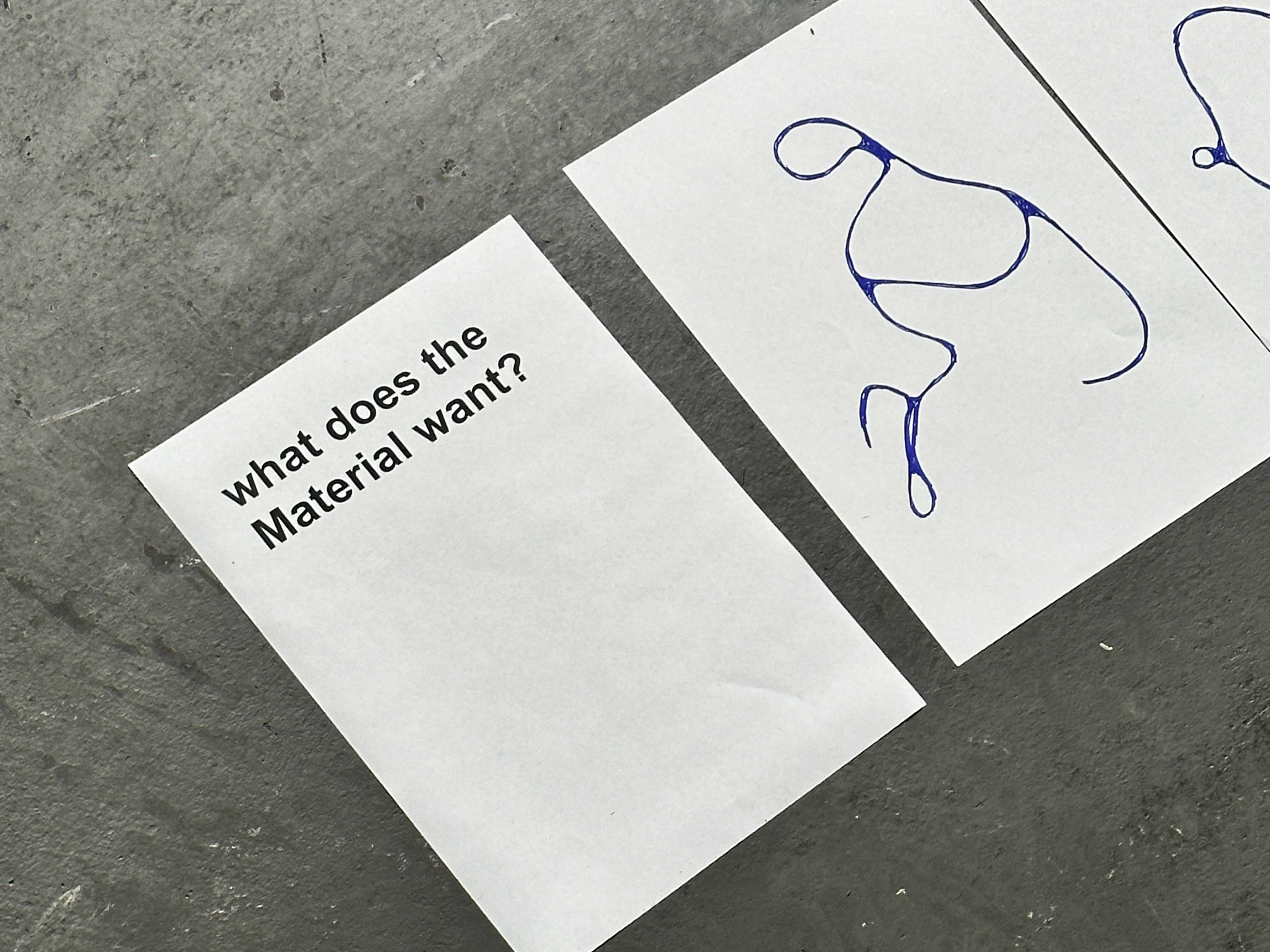
- what does the Material want?
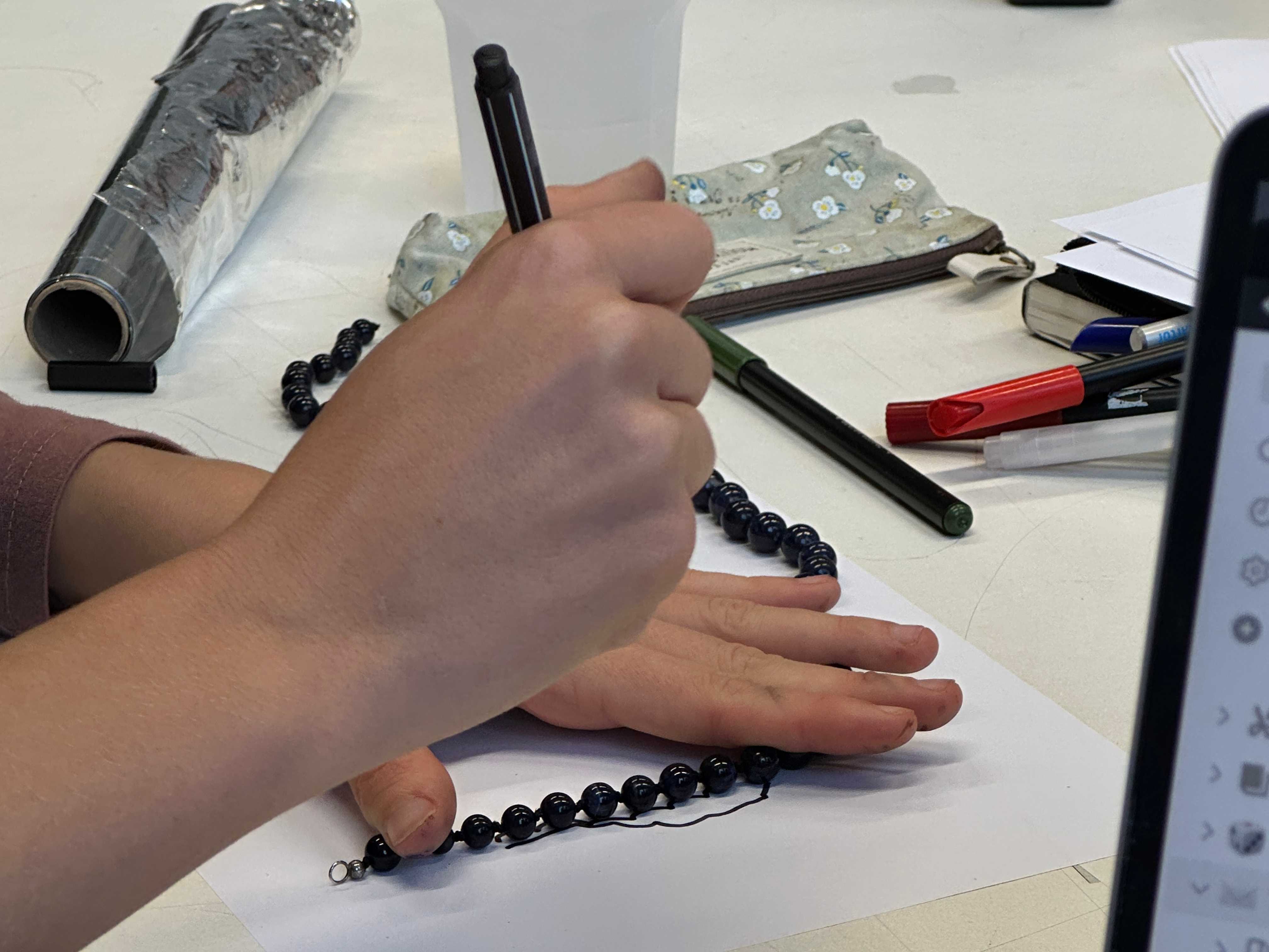
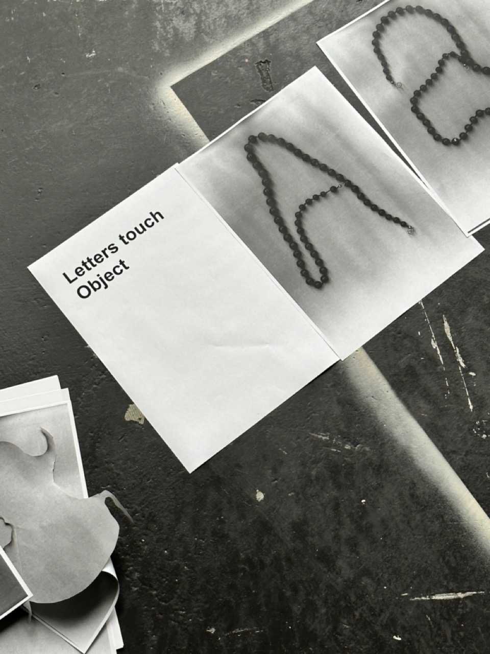
- Letters touch an Object
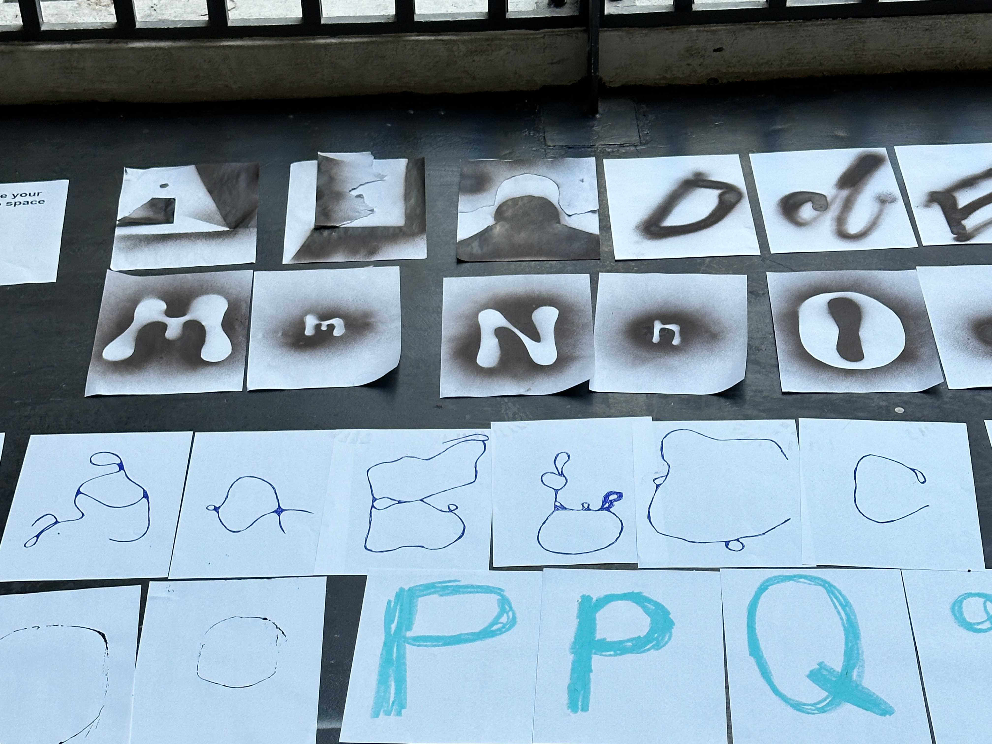
- introduce your letters to the space around you
- use another person as a tool
- use the scanner as a Tool
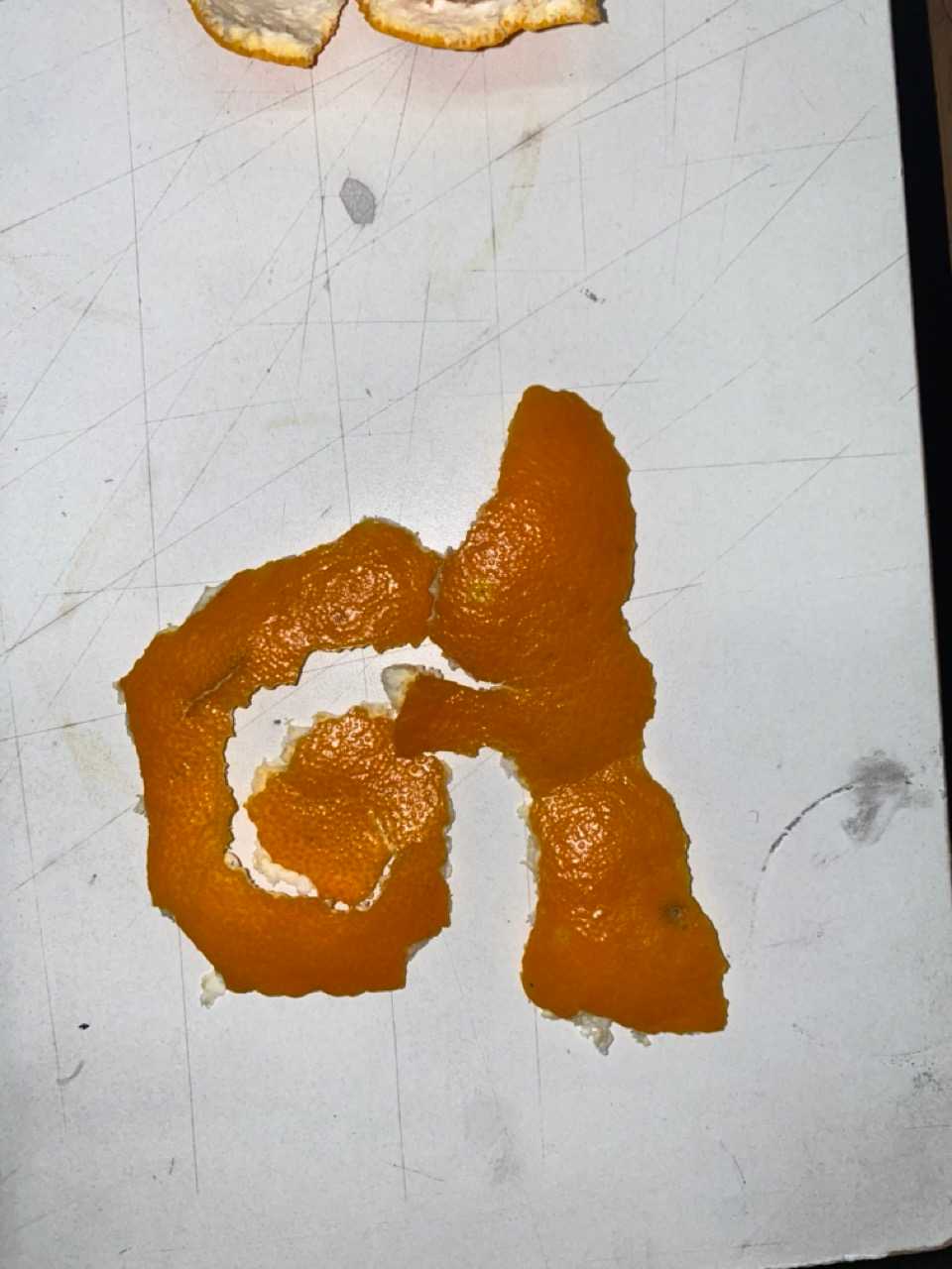
- introduce Nature to Typography
- each Letter different Tool
- Geometry
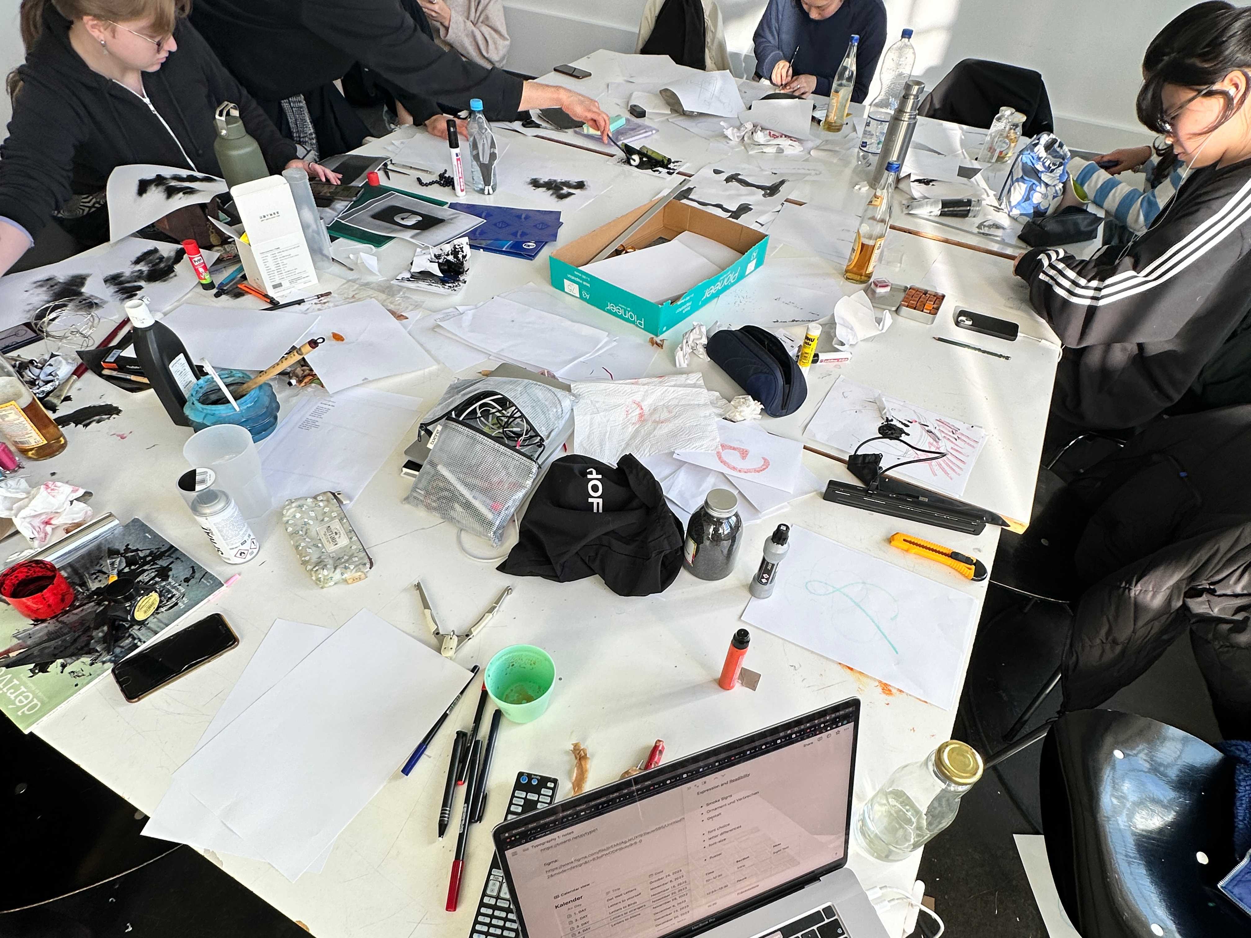
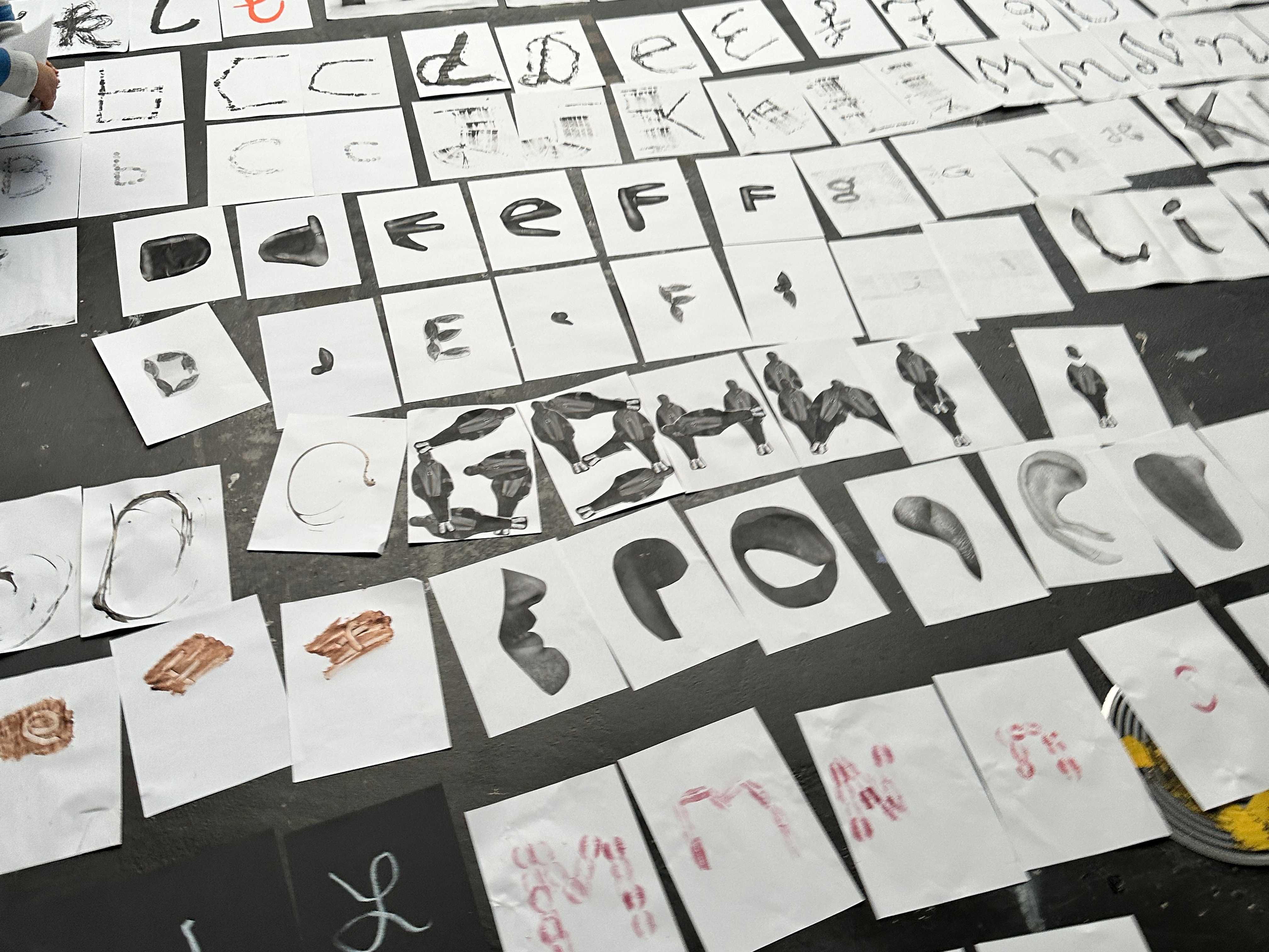
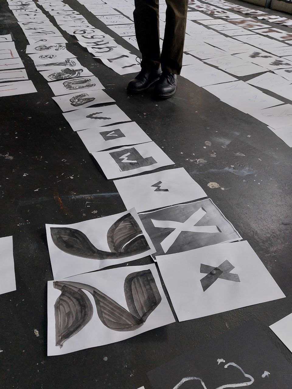
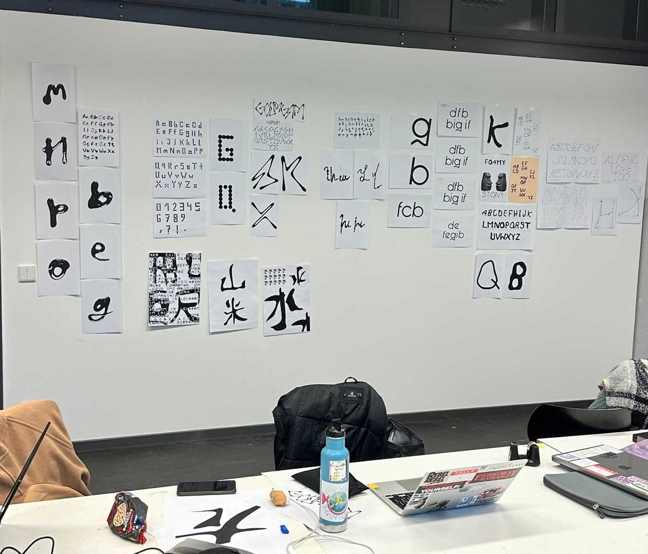
The class and me were actually quite surprised and impressed by the results of this intense hands on day. Every student went through each instruction creating 13 alphabets in upper and lower case. 13 x 26 x 2 = approx. 600 Letters, 600 A4 Pages!
Intermissions
Day 4: Letters to Strangers
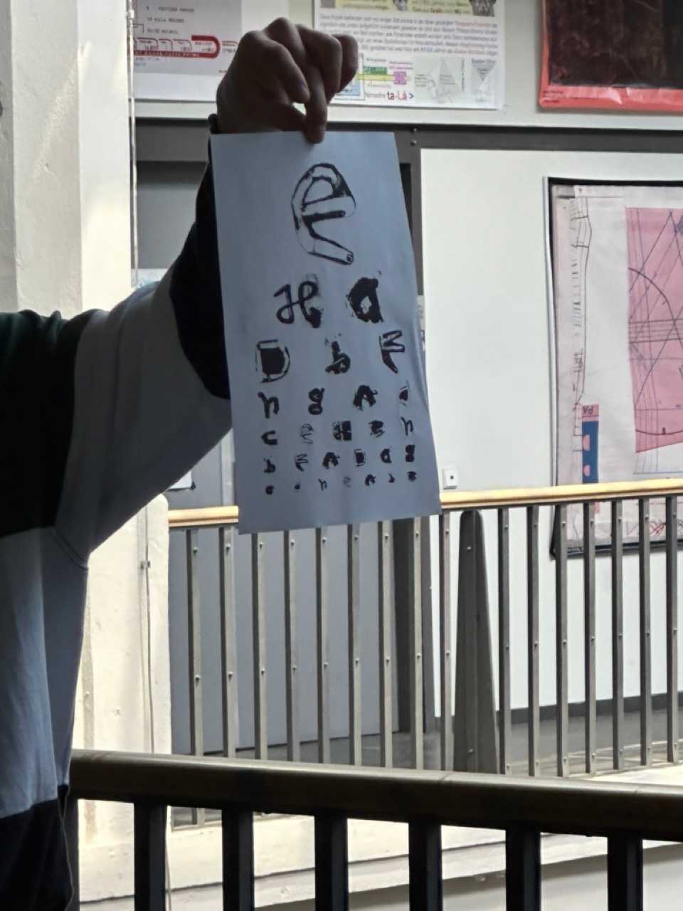
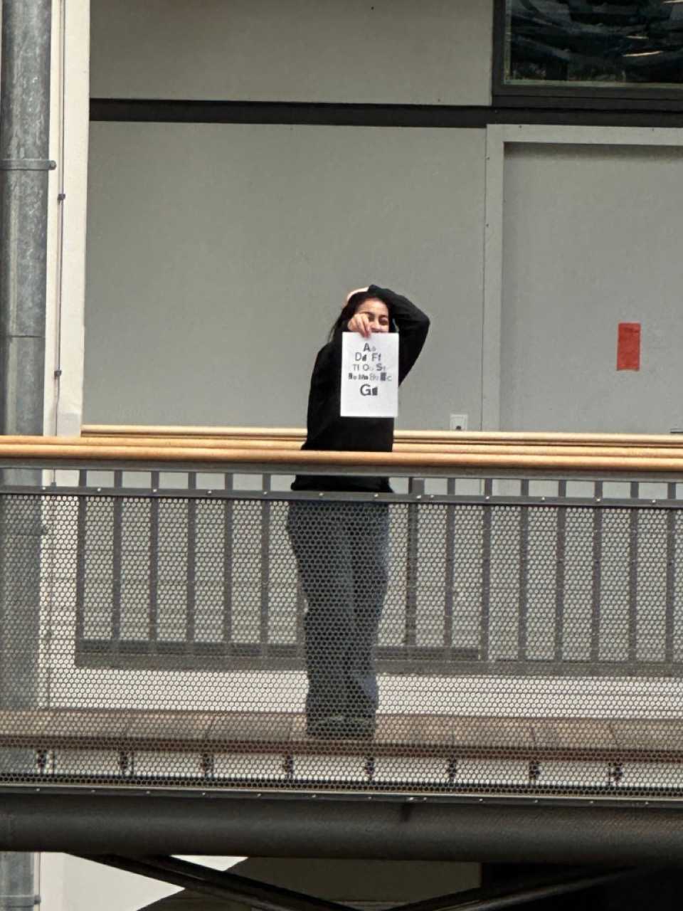
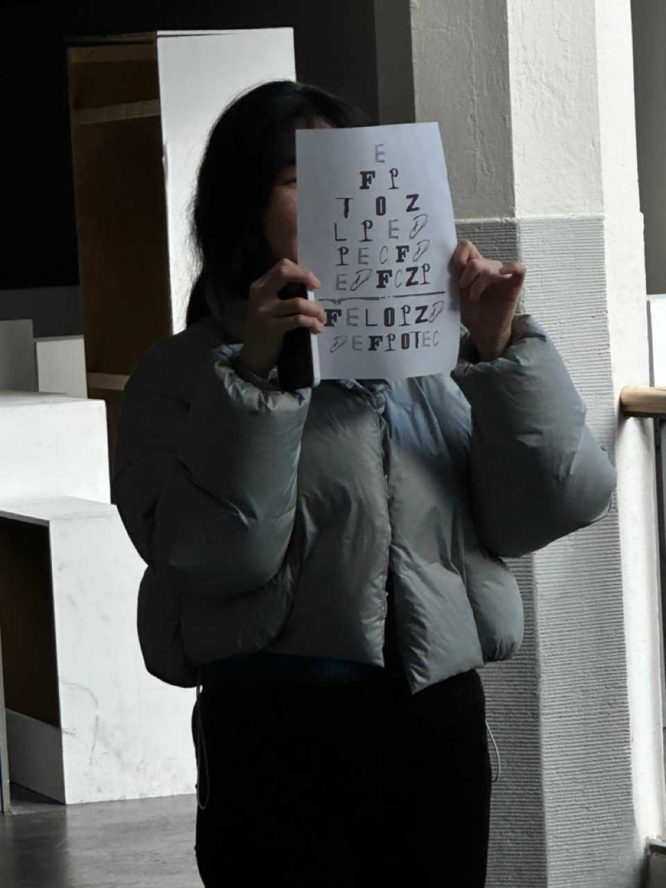
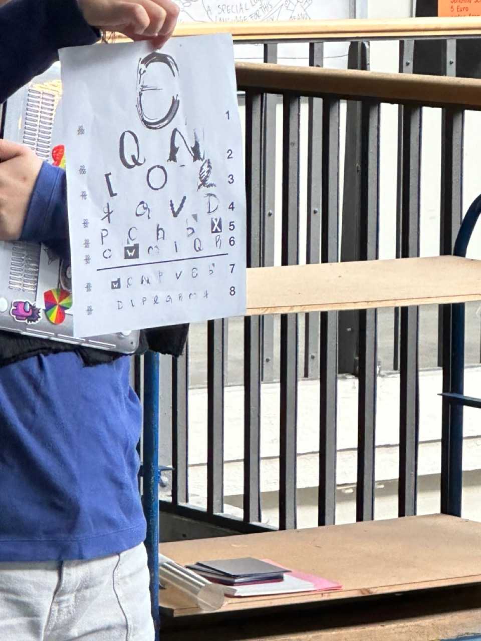
What are conditions for readability? We read parts from The politics of design by Ruben Pater and discussed what makes readability including: literacy, ability, language, culture, person, inclusivity
Gestalt Principles
- Figure-ground
- Proximity
- Similarity
- Continuity
- Closure
- Symmetry
- Uniform connectedness
- Parallelism
- Common fate
- Focal points
- Past experience
- Reification
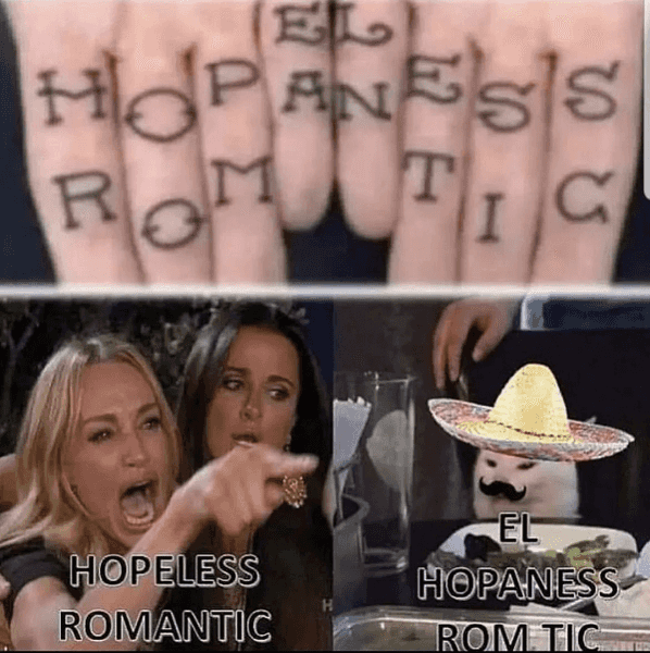
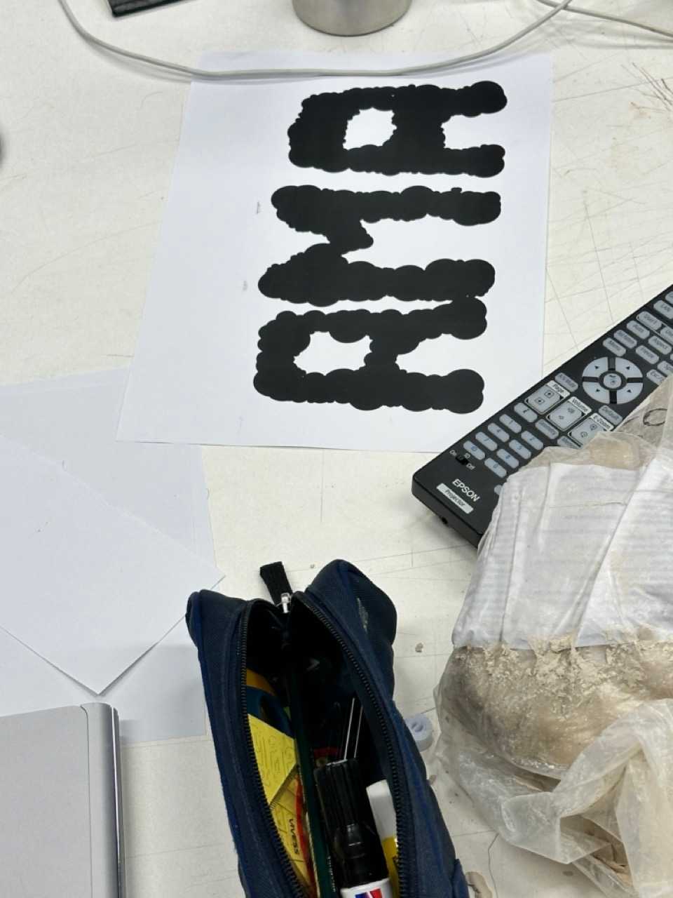
El HOPANESS ROMTIC
Day 5: Letters for Accomplices
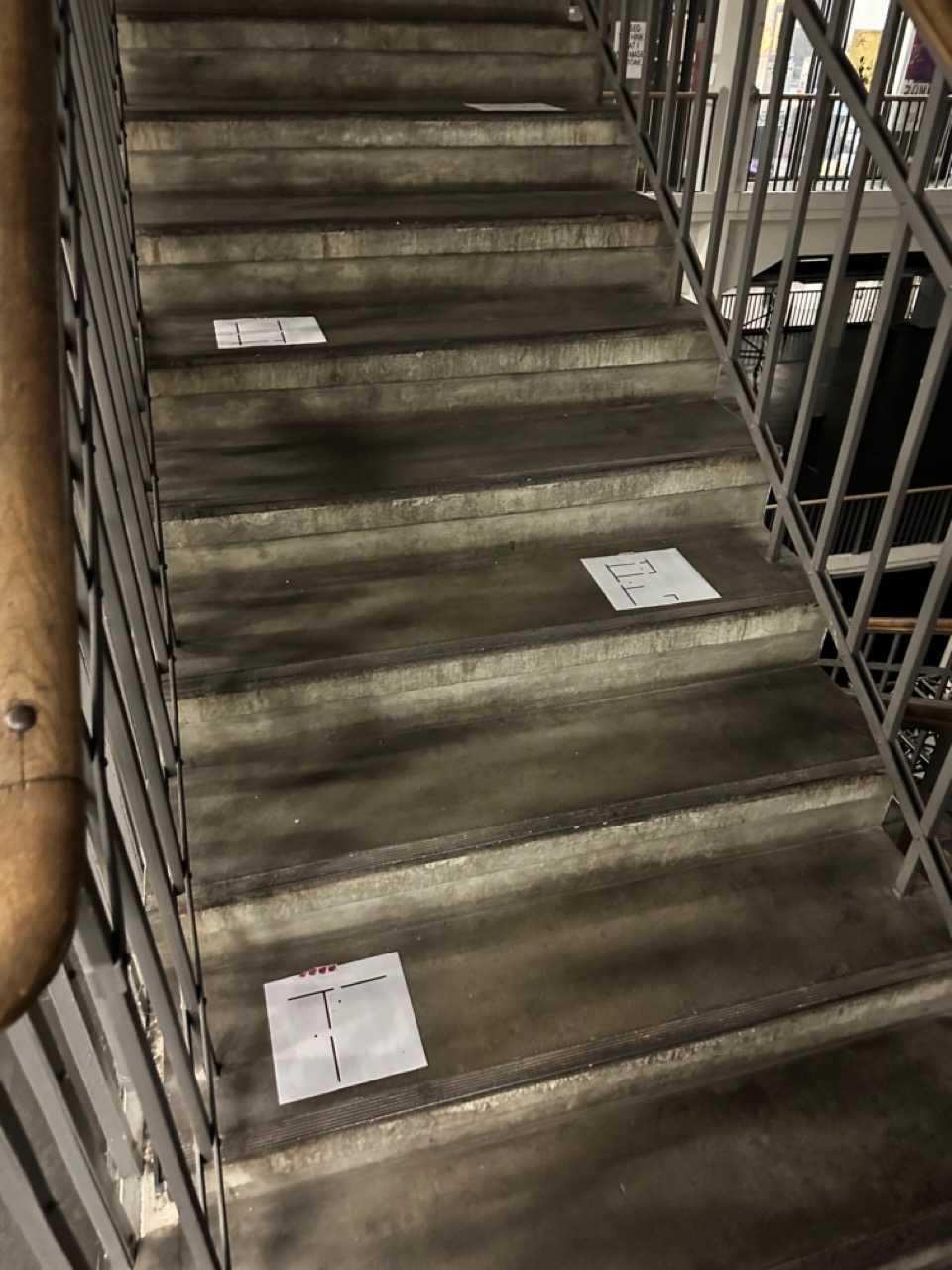
Grid walk, reading “Gloassary of Undisciplned Design” we walked around the school and looked for grids in the architecture. The students handed me the book at the part where I had to quote Britney Spears.
! choose words that describe your work values, whats important to you?
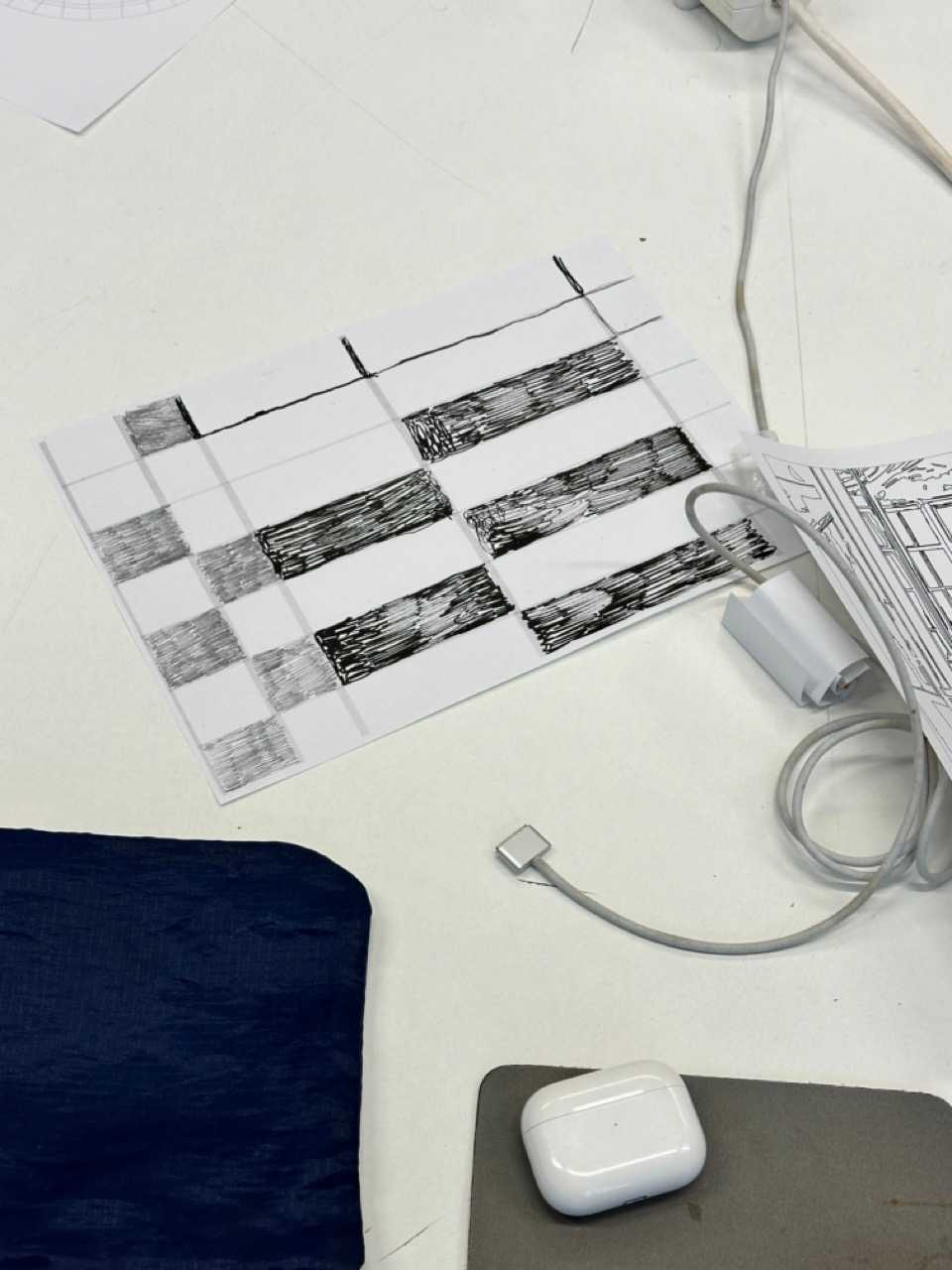
! draw a grid based on the arcitecture of the school
! exchange the grid with some one, draw the letters of your values into the grid
! have the word interact with the space threedimonsionally
Day 6: Letters to Idols
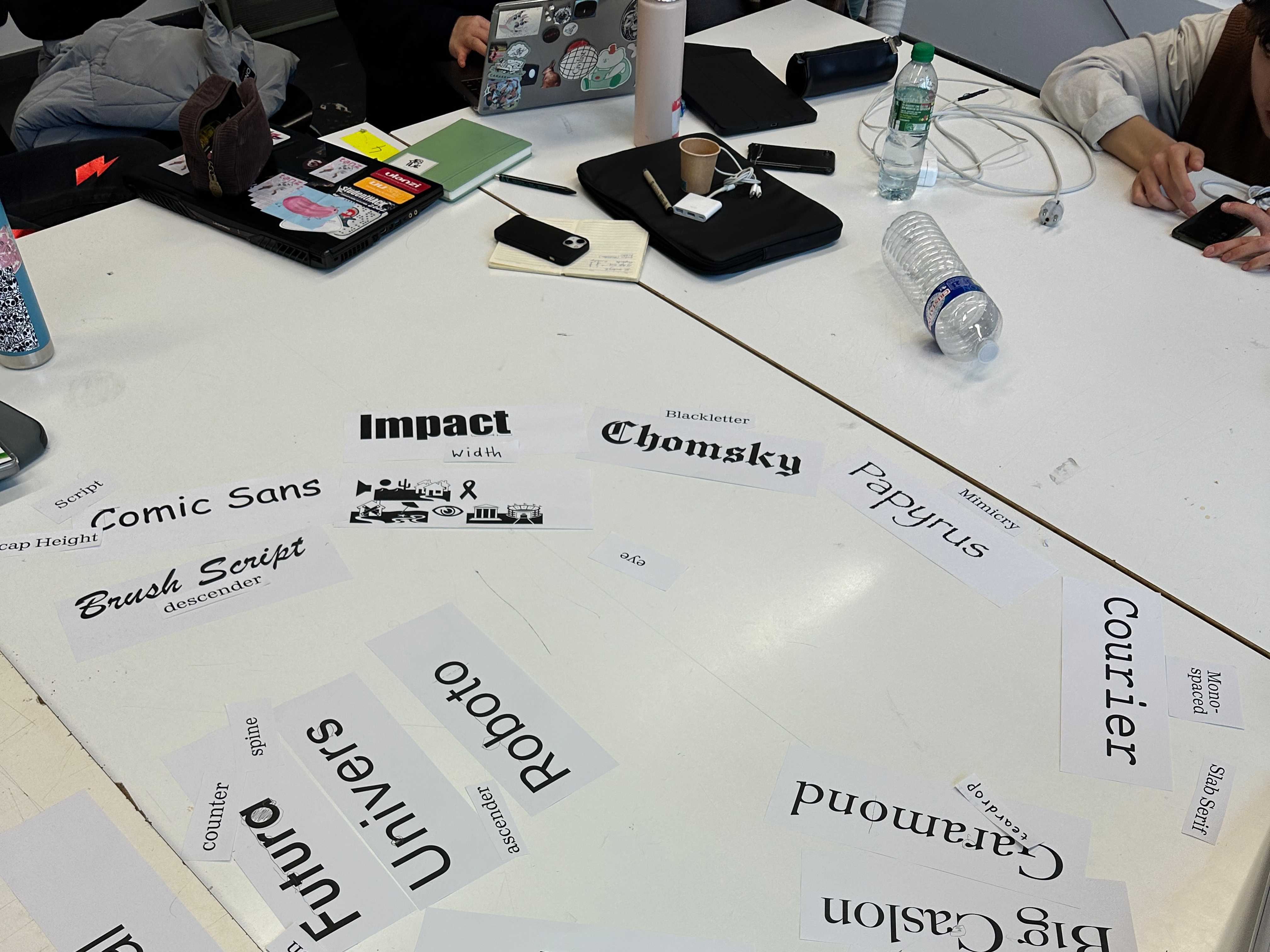
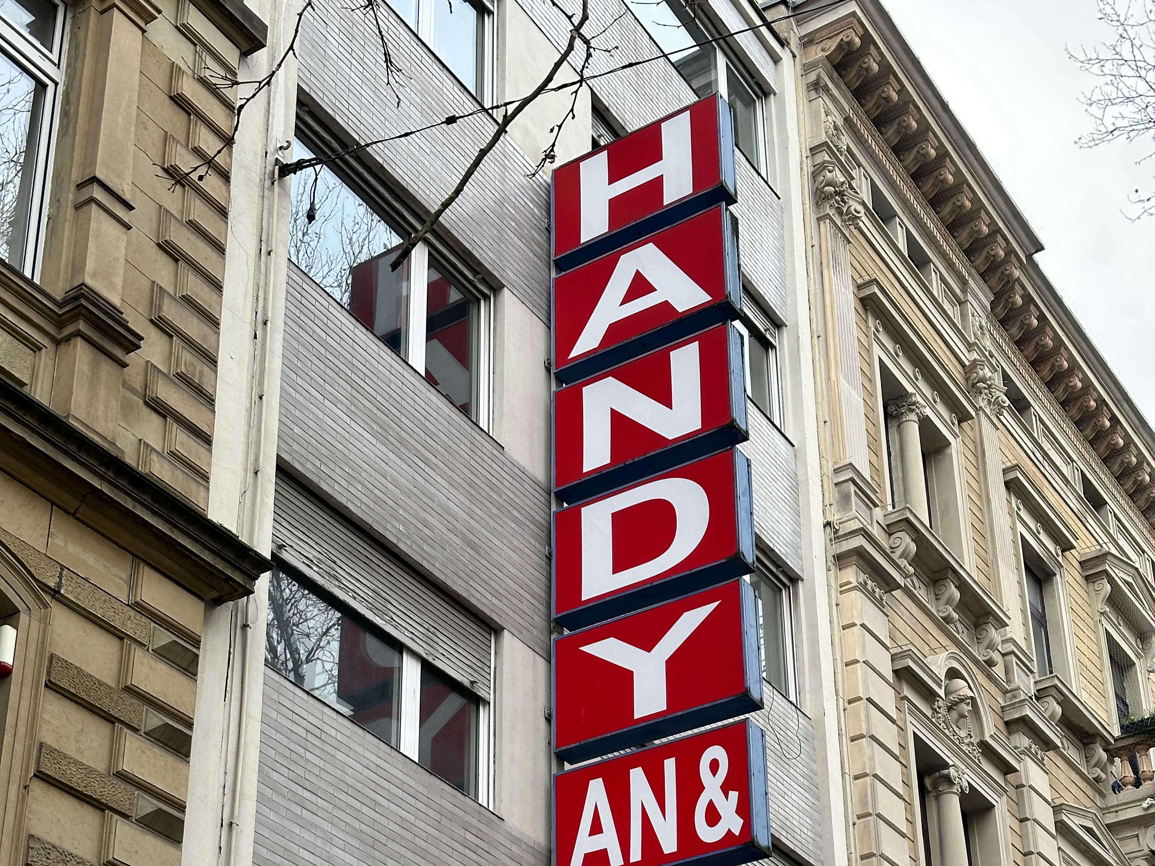
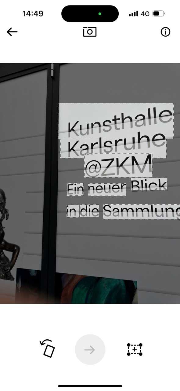
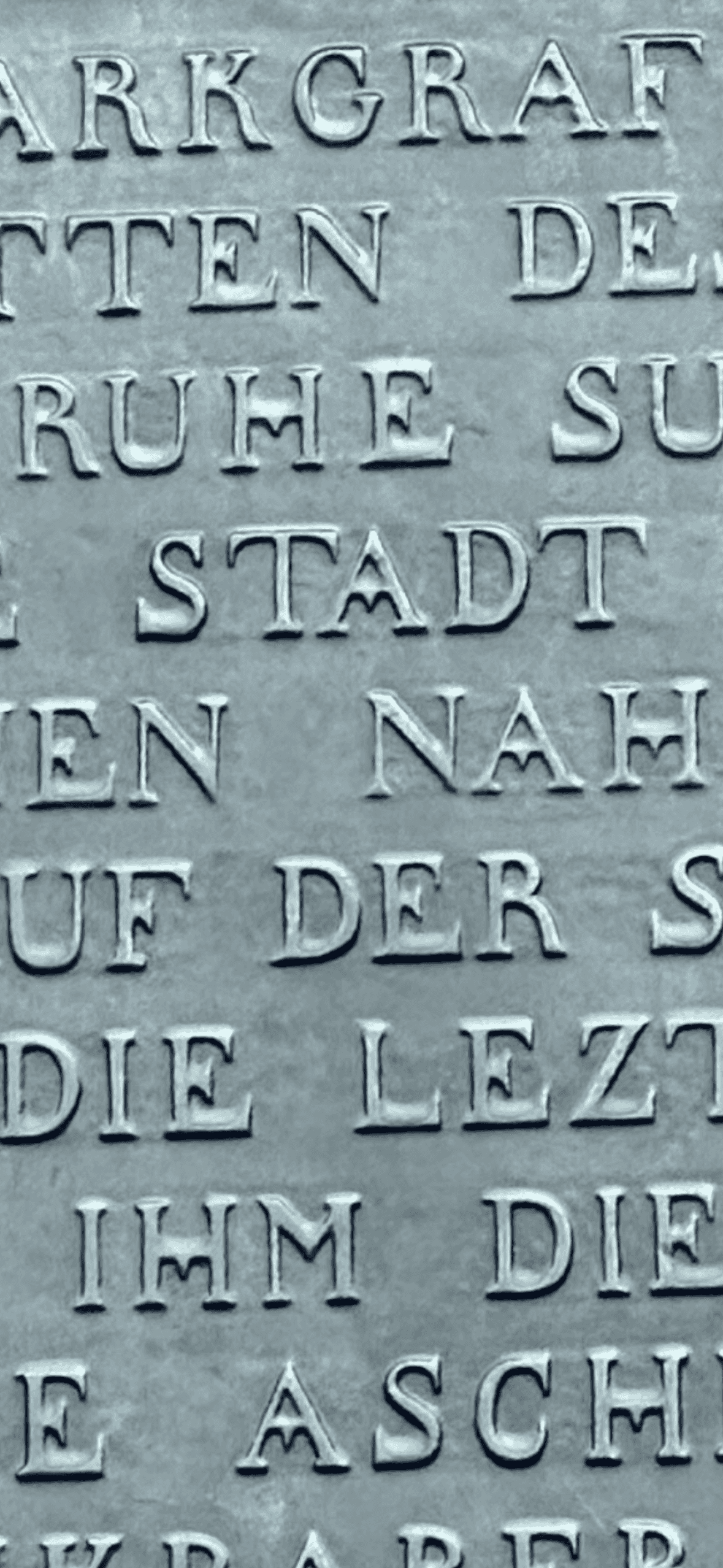
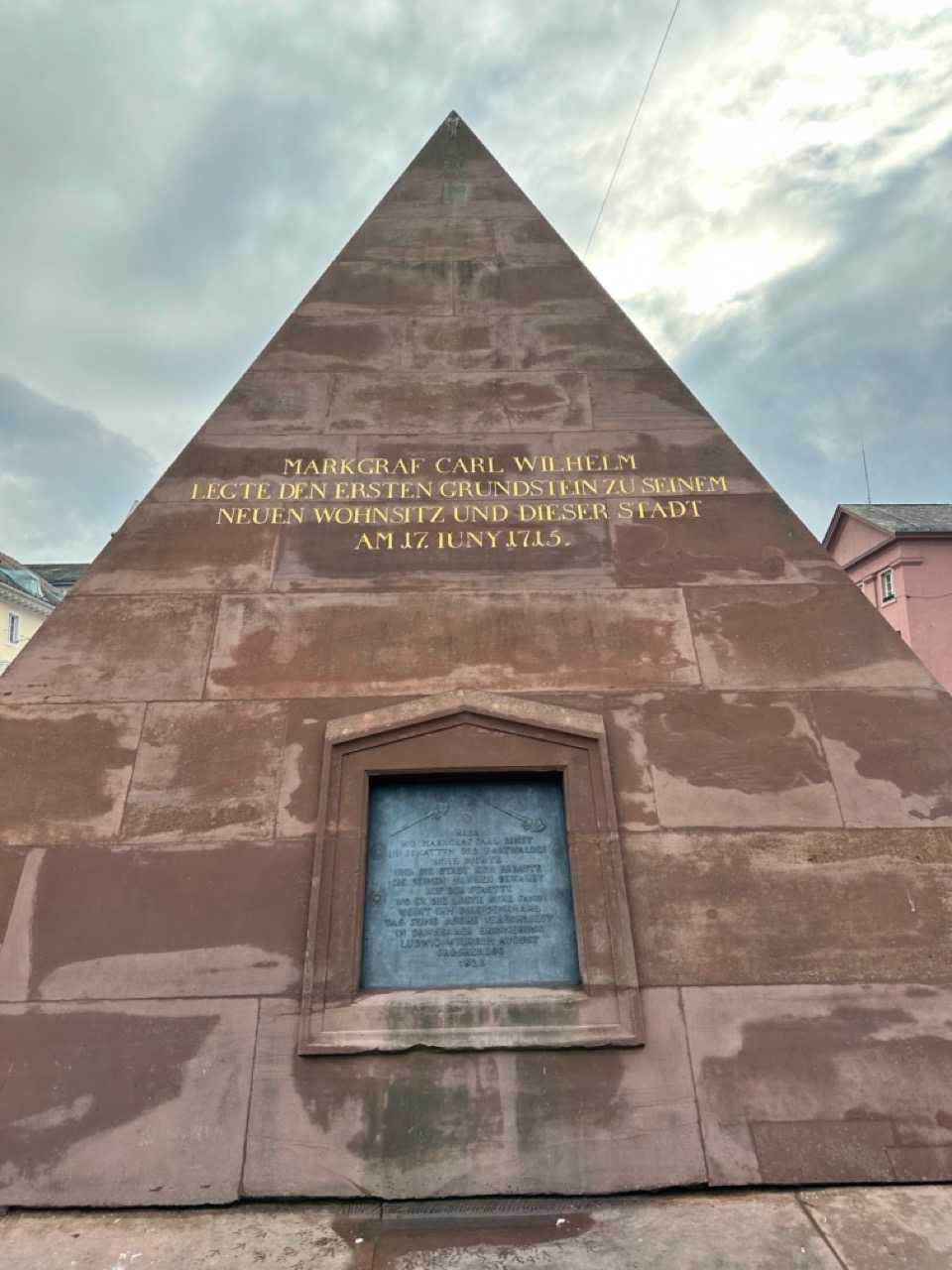
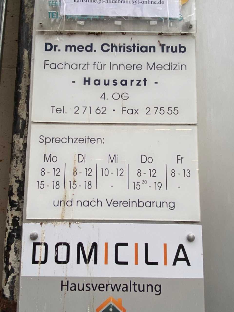
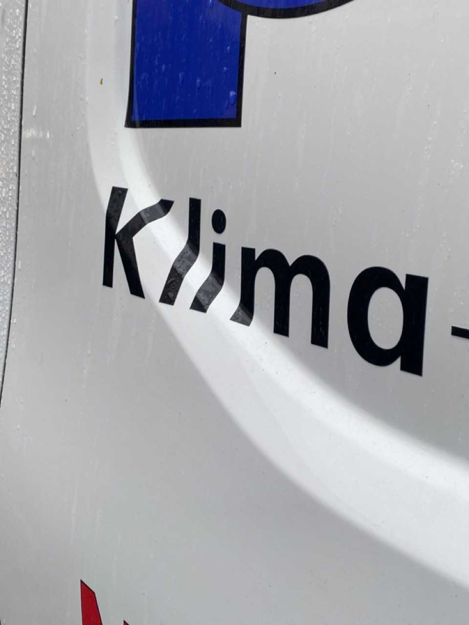
This day the students prepared presentations on popular typefaces using specific vocabulary to describe the letterforms (from Anatomie der Buchstaben) as well as historic context. Afterwards we went to the Kaiserstraße in Karlsruhe to look for these typefaces in their natural habitat.
- Eunsoo: Helvetica
- Lena: Adobe Garamond
- Levi: Futura
- Max: Bodoni
- Helena: Rockwell
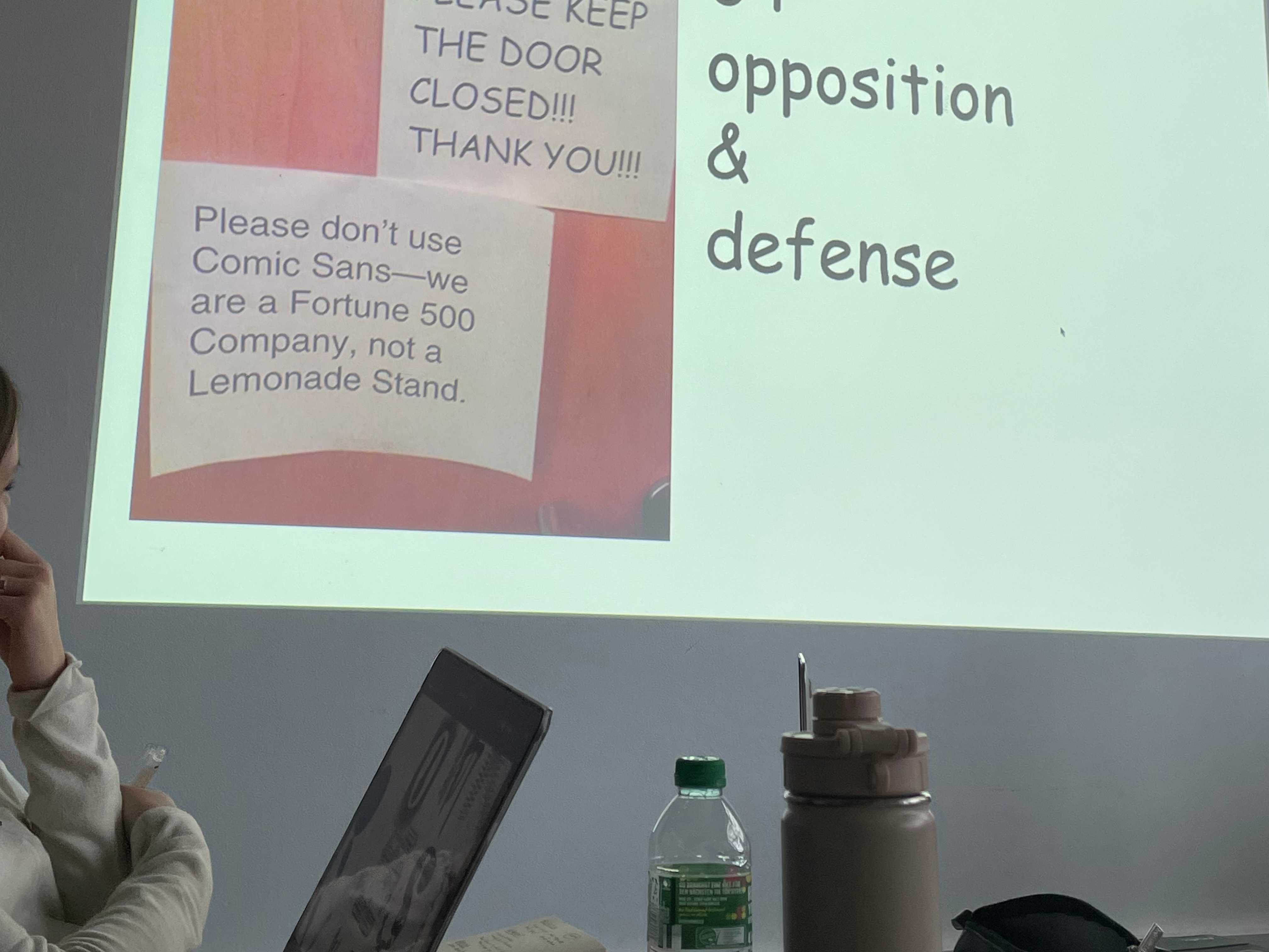
- Jinhyung: Comic Sans
- Kaya: Arial
- Jiaxuan: Caslon
- Finn: Times New Roman
- Nayeon: Impact
- Veronika: Roboto
- Min Jung: Baskerville
- Alice: Univers
- Abdel: Papyrus
Font Sightseeing
DAY 7: Letters to a new Year
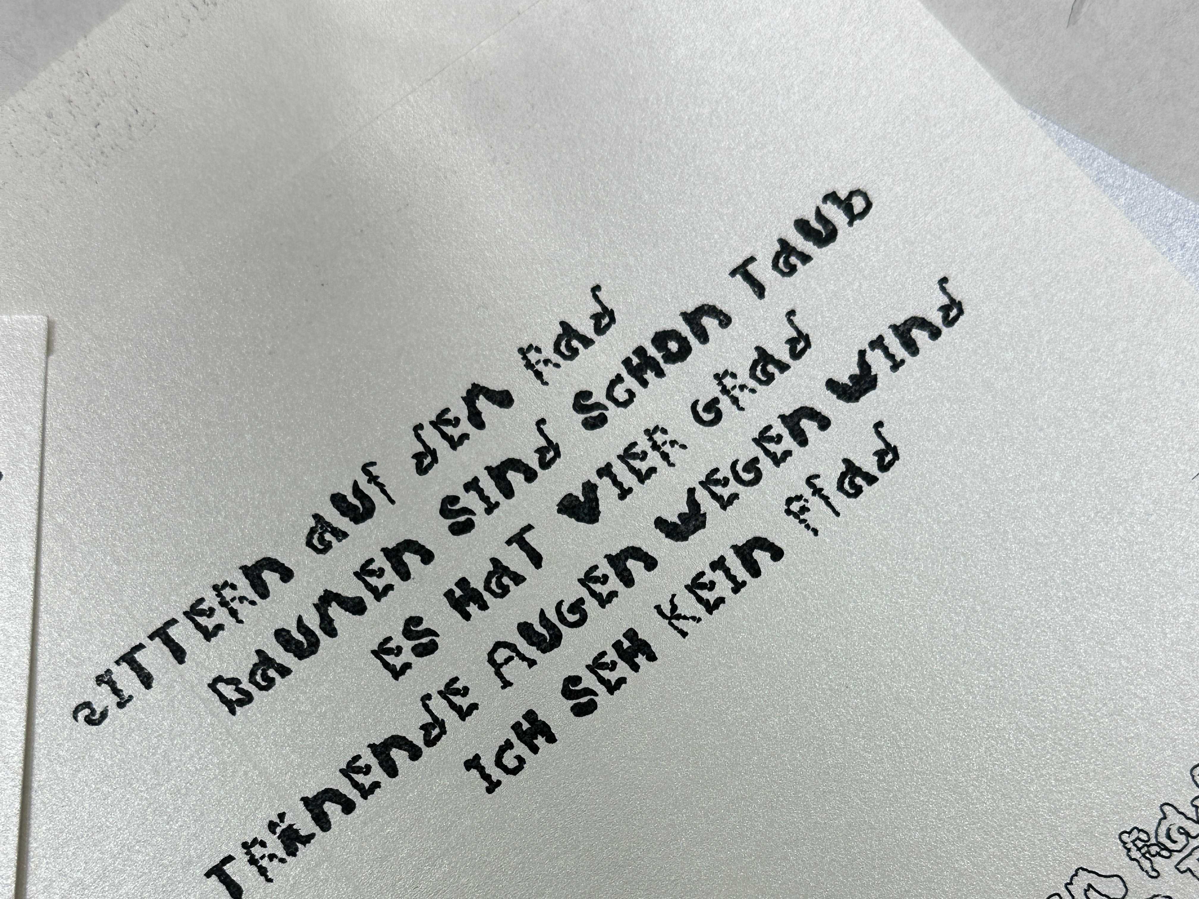
NoFoundry Presentation and Glyphs Clementine Workshop with Timothee Charon. We created our first typeface in Glyphs called Enitnemelc
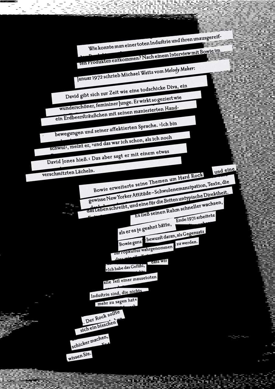
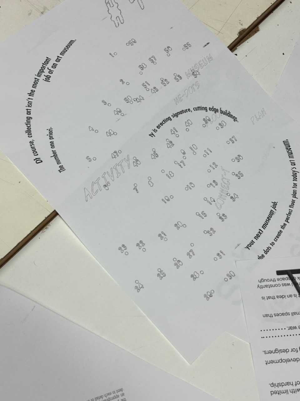
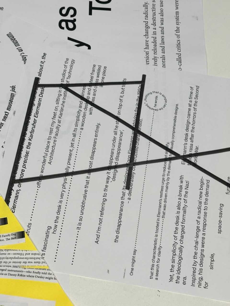
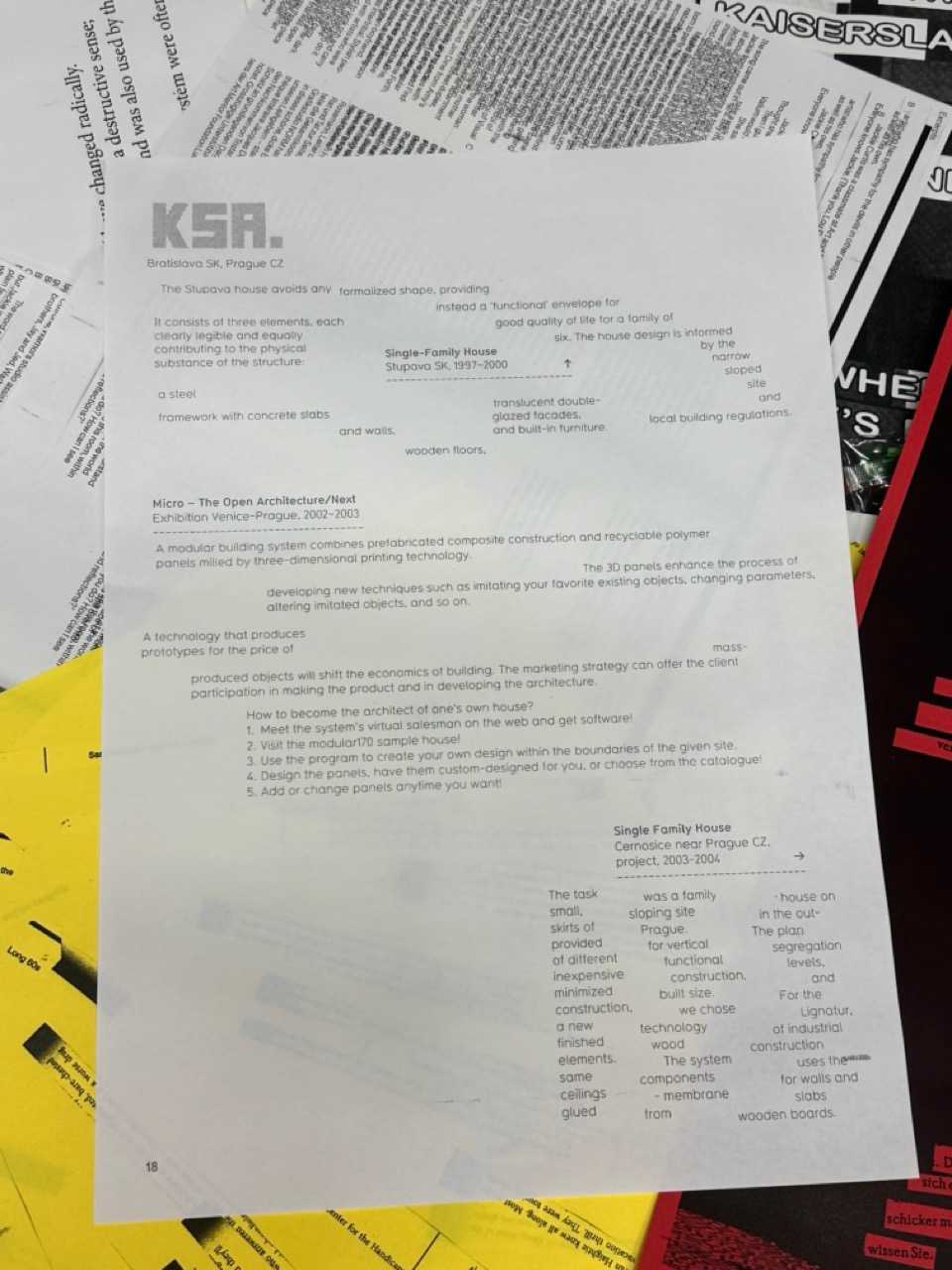
DAY 8: Letters to the Printer
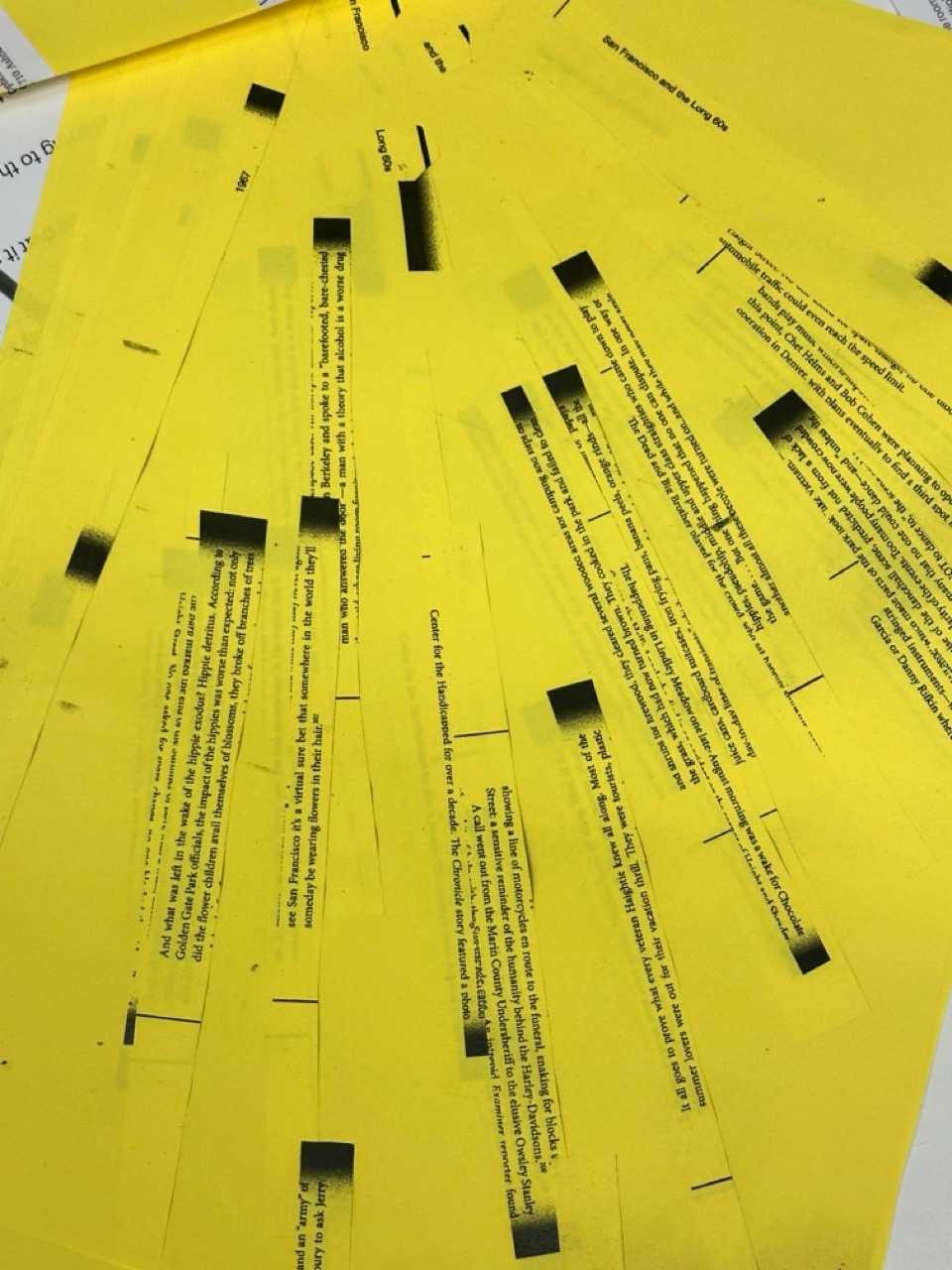
! pick a random book, random page and scan
! Rearrange the text of the page on A3 either to support the topic of the book, or to contradict it, print several versions
DAY 9: Letters to Aliens
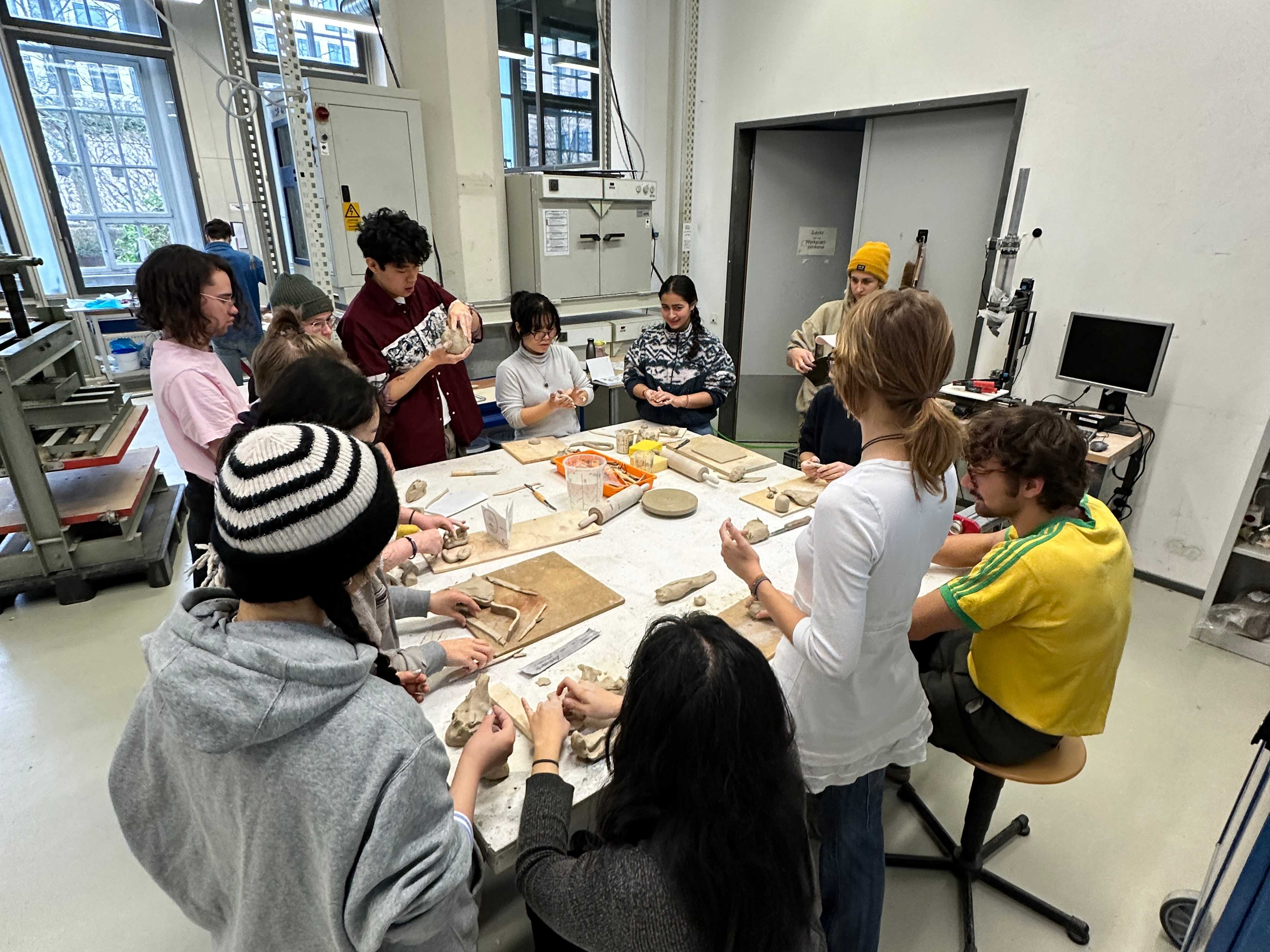
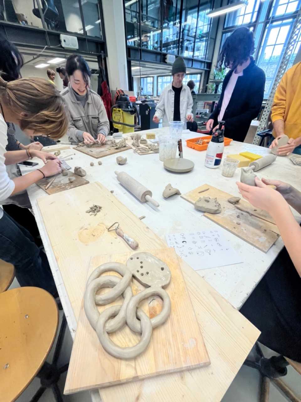
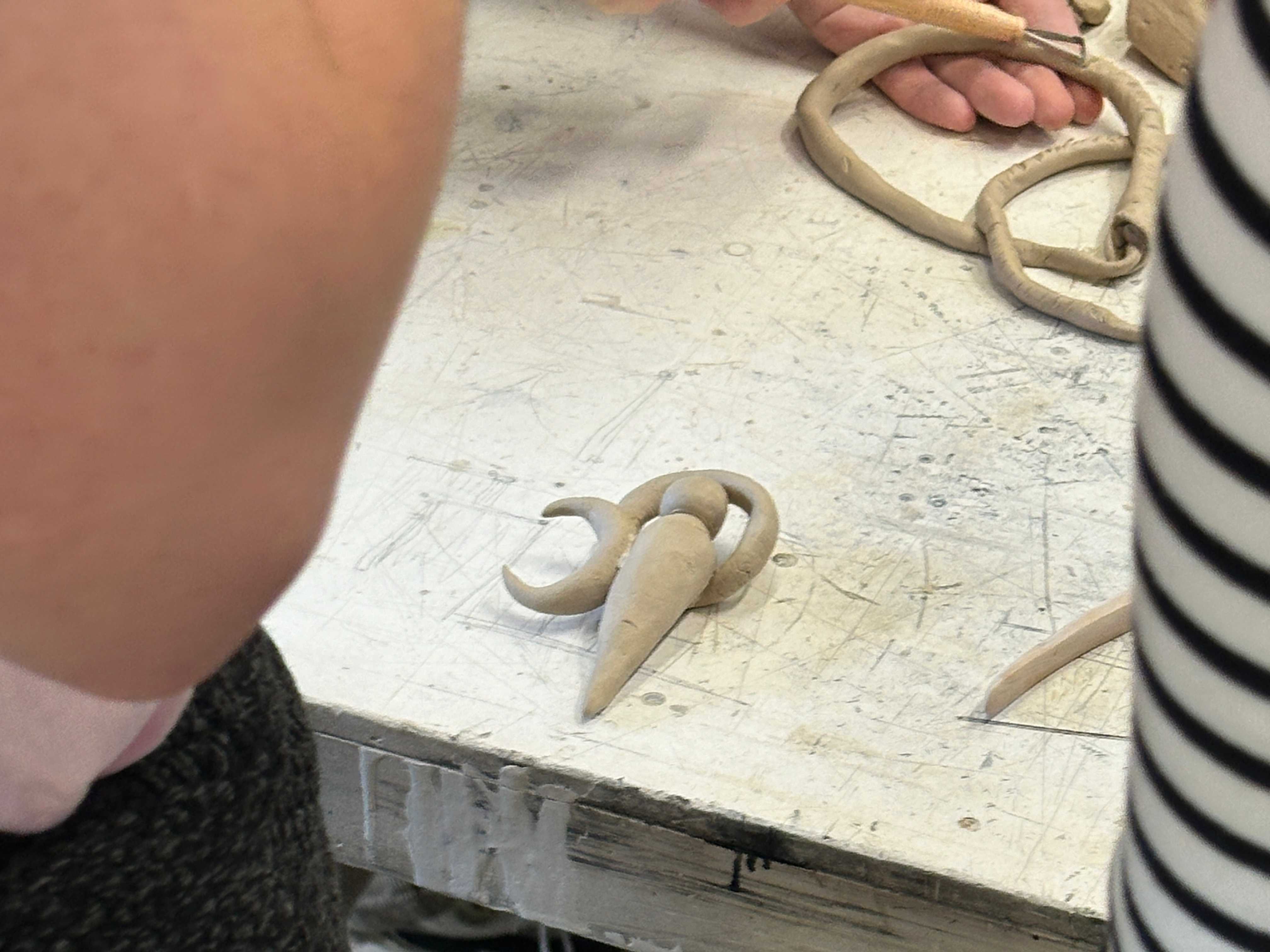
Close your eyes, You are in a different place in a different time. In fact you don’t know what year it is, the concept of periodic time tracking has not been invented yet. Nor has been actually anything else. You find yourself standing on soft ground, the soil slightly wet from rain, some smaller and some bigger stones scattered around, accompanied be bushes and trees here and there, but no sight of houses or people, just distant sounds of some yet unknown creatures. Many years later this era will be known as the stone age.
Without much thinking you kneel down to pick a handful of the soil, press it together between your hands to give it structure and slowly realize that you just time traveled from a seemingly advanced civilization that is still struggling with basic crises to a time where language has not yet developed. what information will you leave behind for the humans to come, and how? what are the signs and symbols that one will understand without the luxury of alphabets?
you have 45 minutes until a hungry T-Rex will find and eat you.
→ extra task: invent your first word
DAY 10: breathing Letters
! what sound does your typeface make? Record the sound
! how does your type move? Animate your typeface for your phone
Participants
Eunsoo Choi
Lena Klevenow
Levi Zimmermann
Max Beller
Helena Bänsch
Jinhyung Hur
Kaya Männel
Jiaxuan He
Finn Milbrandt
Nayeon Park
Veronika Baghdyan
Min Jung Kim
Alice Seefried
